UI Redesign of the Bandcamp App
Time: 3 days
Team: Solo project
Brief: Redesigning the UI of a relatively well-known app
Scope: 3 screens, including 1-2 micro-interaction animations
Chosen App: Bandcamp, in iOS
Tools: Figma, Pinterest
Cloning screens & UI Inventory
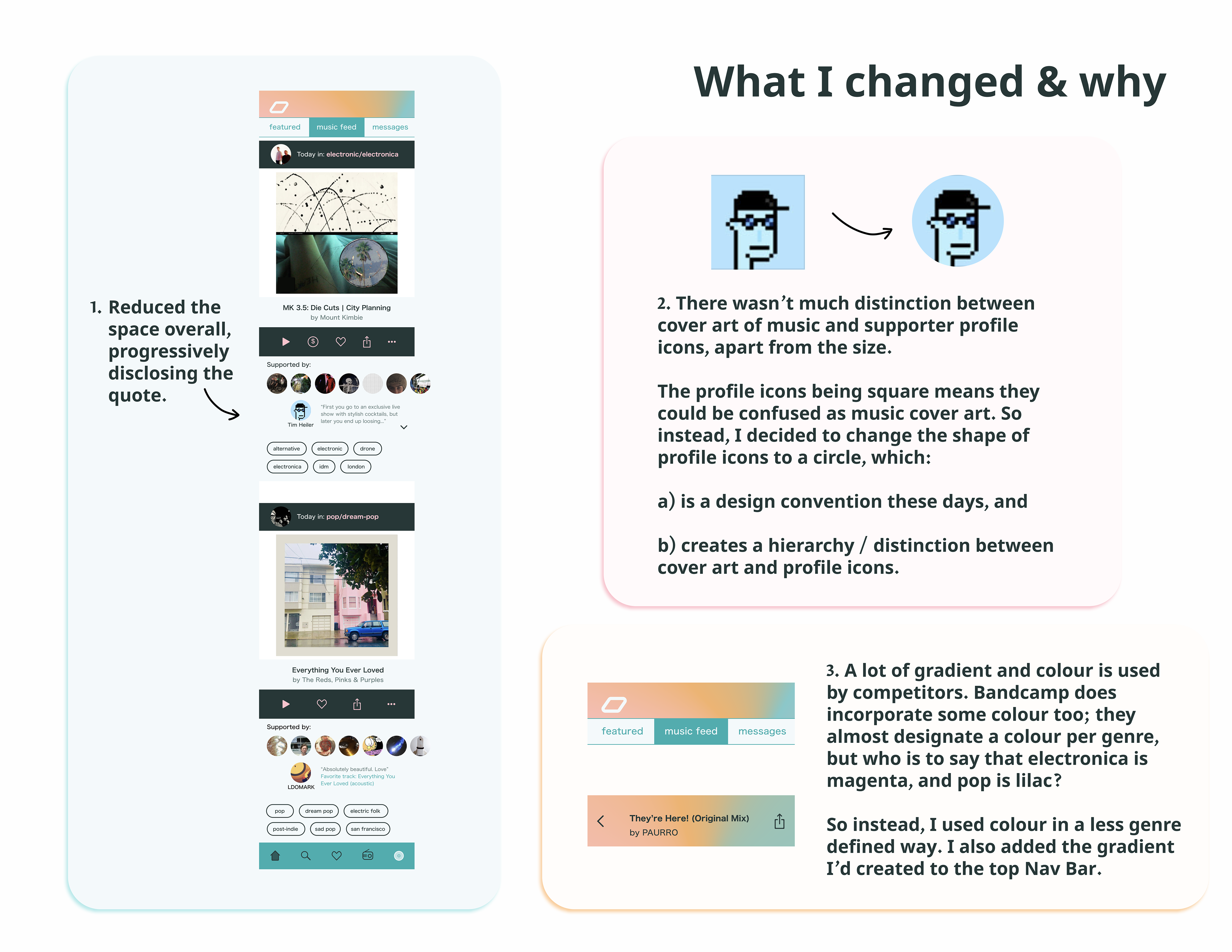
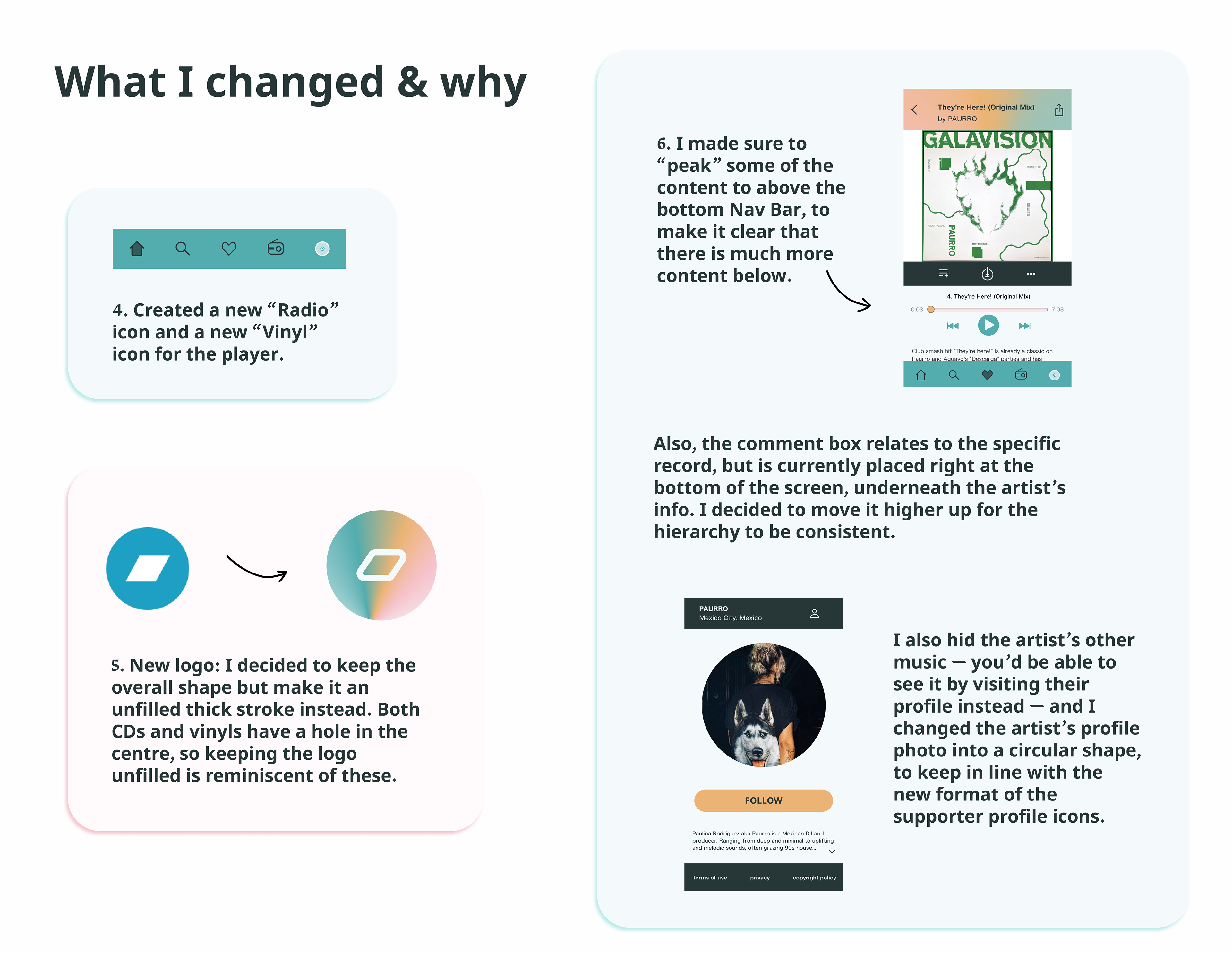
The first step was to choose and clone the screens in Figma. After realising I hadn't noticed 2x more screen length in one of my chosen screens, I had to quickly clone the rest of that too, which was unexpected, but a great indicator of something to change in the redesign: a peak of content to hint that there is far more information below.
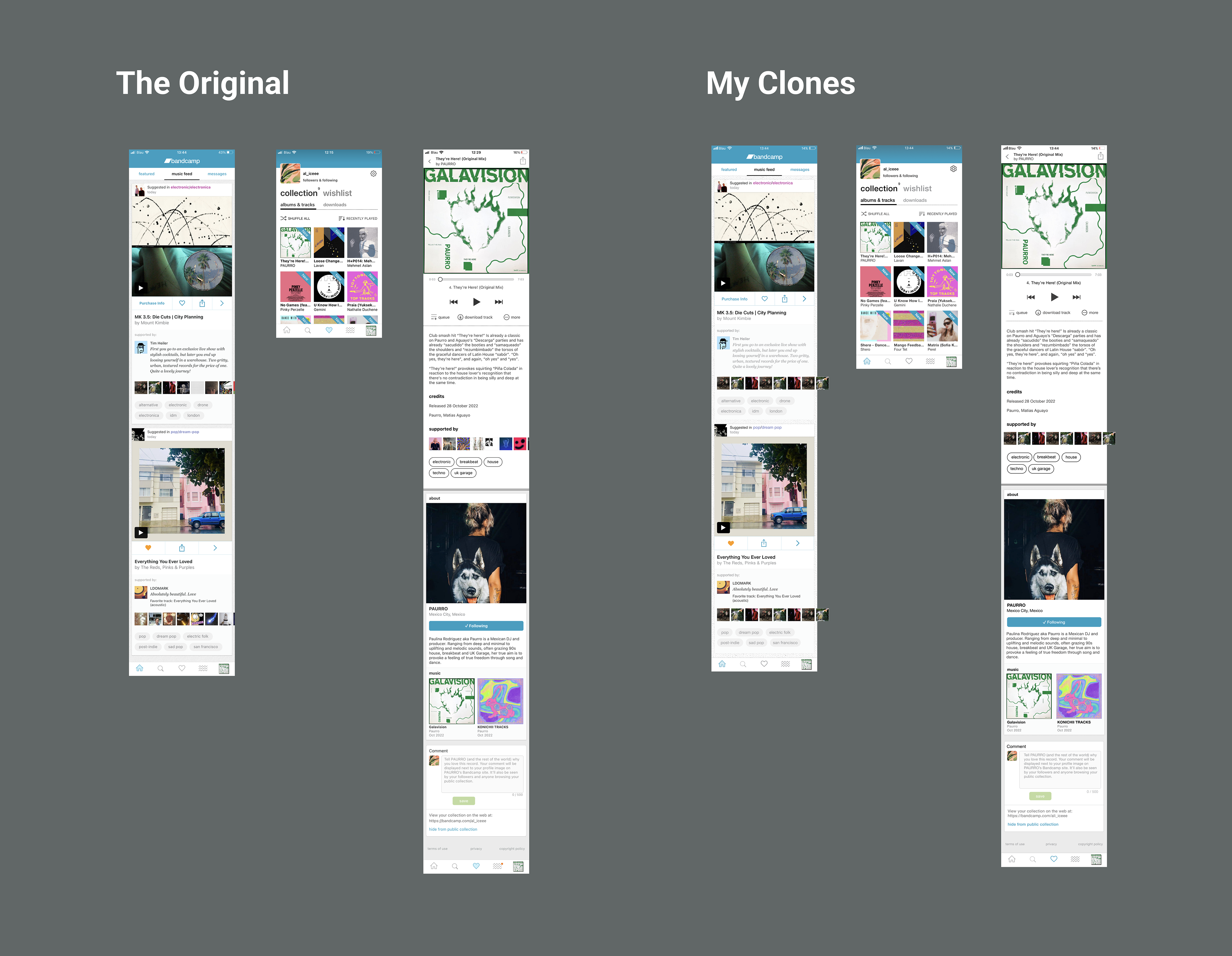
Overview of my chosen screens and my clones
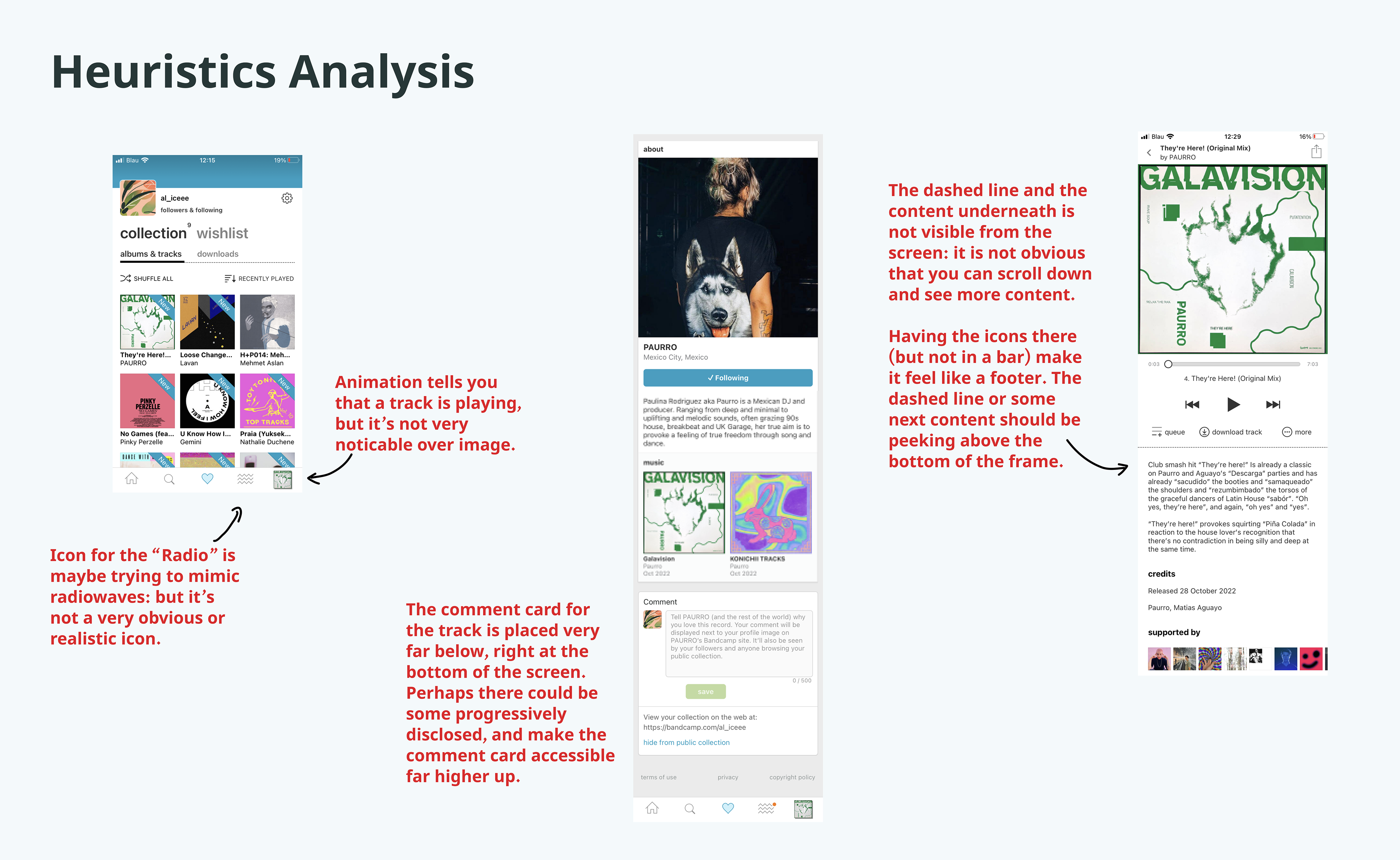
The next step was to conduct a Heuristics Analysis on my chosen screens, to highlight both issues but also successes within the 10 areas.
Visual Competitive Analysis
For this I looked at Spotify, Soundcloud and iTunes Store, as they are more or less direct competitors to Bandcamp. I noticed that they each have high-contrast colour palettes, using a black colour with highly-saturated bold colours.
Defining the re-brand
Bandcamp, compared to Spotify and Soundcloud and definitely iTunes Store, really highlights the community that is supporting the music, as well as priding itself on the portion of profits that go directly to the artists.
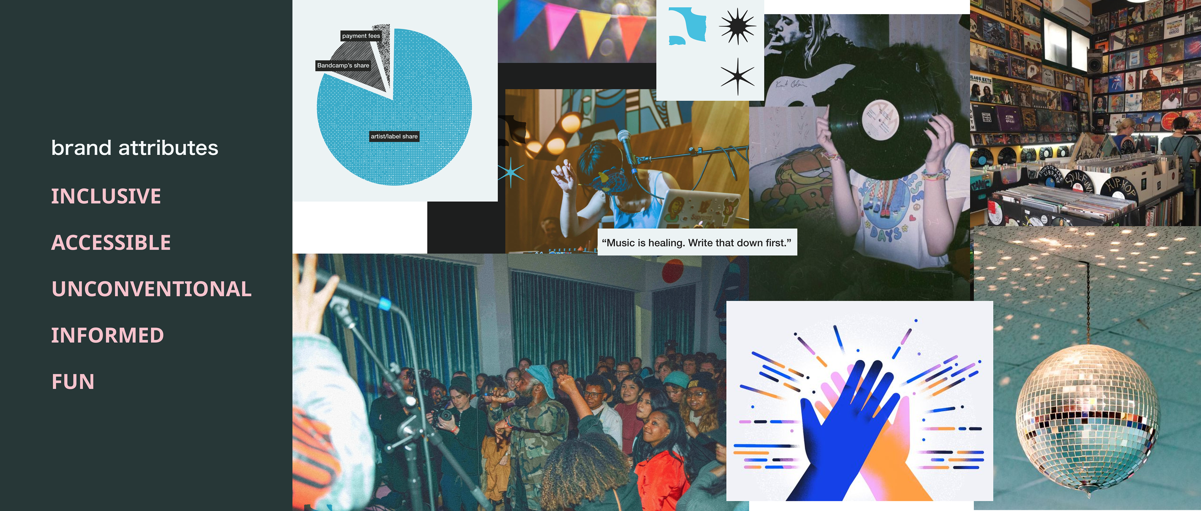
I couldn’t find any directly stated brand attributes on the Bandcamp website, but I combined the approach communicated in their About page, with impressions from the artists I follow who sell their music on there, and came up with the following attributes:
- Inclusive, Accessible, Unconventional, Informed & Fun
Then I put together a mood-board based on these Brand Attributes which was really fun. I actually used half images from their About page, and then added the other half from Pinterest, overall trying to capture a mood — but also keeping in mind the brand attributes.
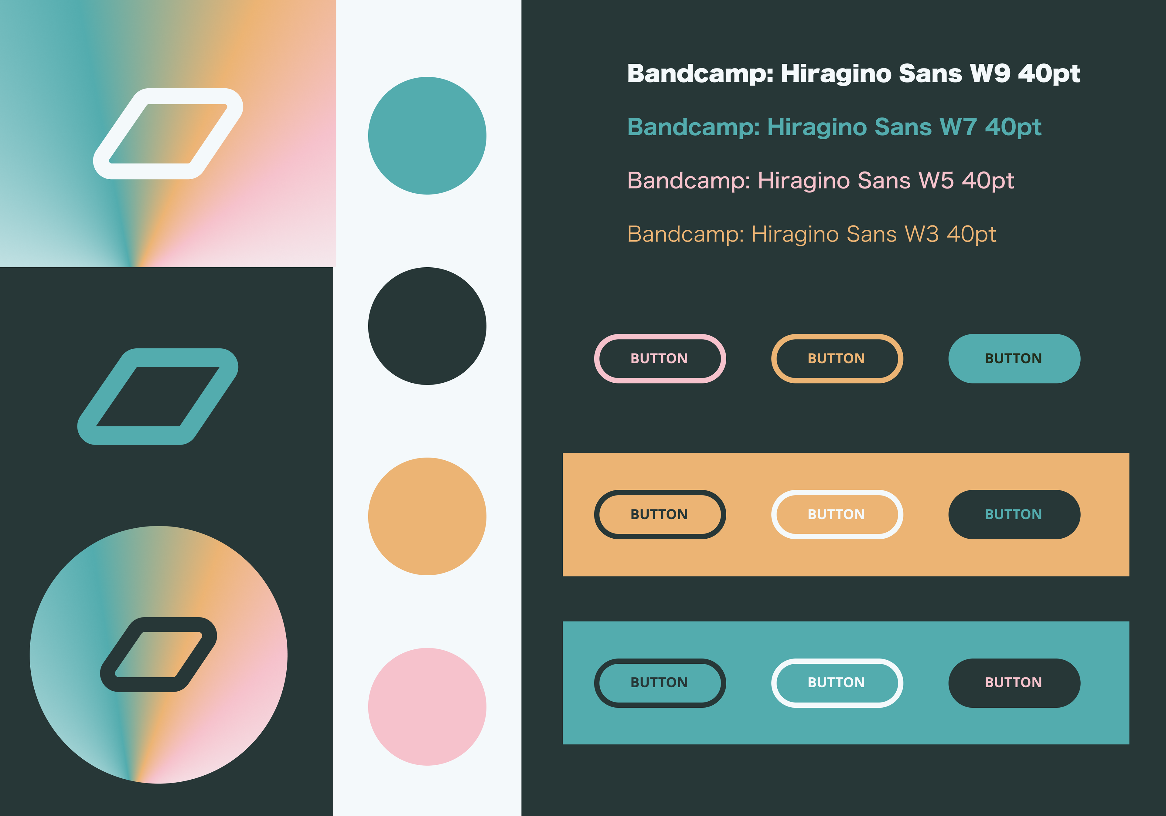
Next, I pulled a colour palette from the mood-board, did some colour and contrast testing, and from that refined it a bit. In the new palette, I tried to bring the new brand attributes and mood-board alive. I feel like Bandcamp is already those things, but the current palette and style doesn’t really reflect it.
Original Primary Brand Colour
Their primary brand colour at the moment is a quite standard and inoffensive blue colour. They do have an alternative primary brand colour of an almost grey-teal colour available in their logo asset page on their website, but it’s not used anywhere in the app.
Blue is traditionally a colour with masculine connotations; could bringing in some other colours make more people feel even more included?
At the same time, the music producer world is also predominantly male, and this link gave me even more reason to incorporate additional colours; to encourage non-male identifying artists to feel included in the space.
The gradients were also a way to bring a bit of fun to the situation. I like how the circular logo version on the bottom left of the style tile almost feels like a CD.
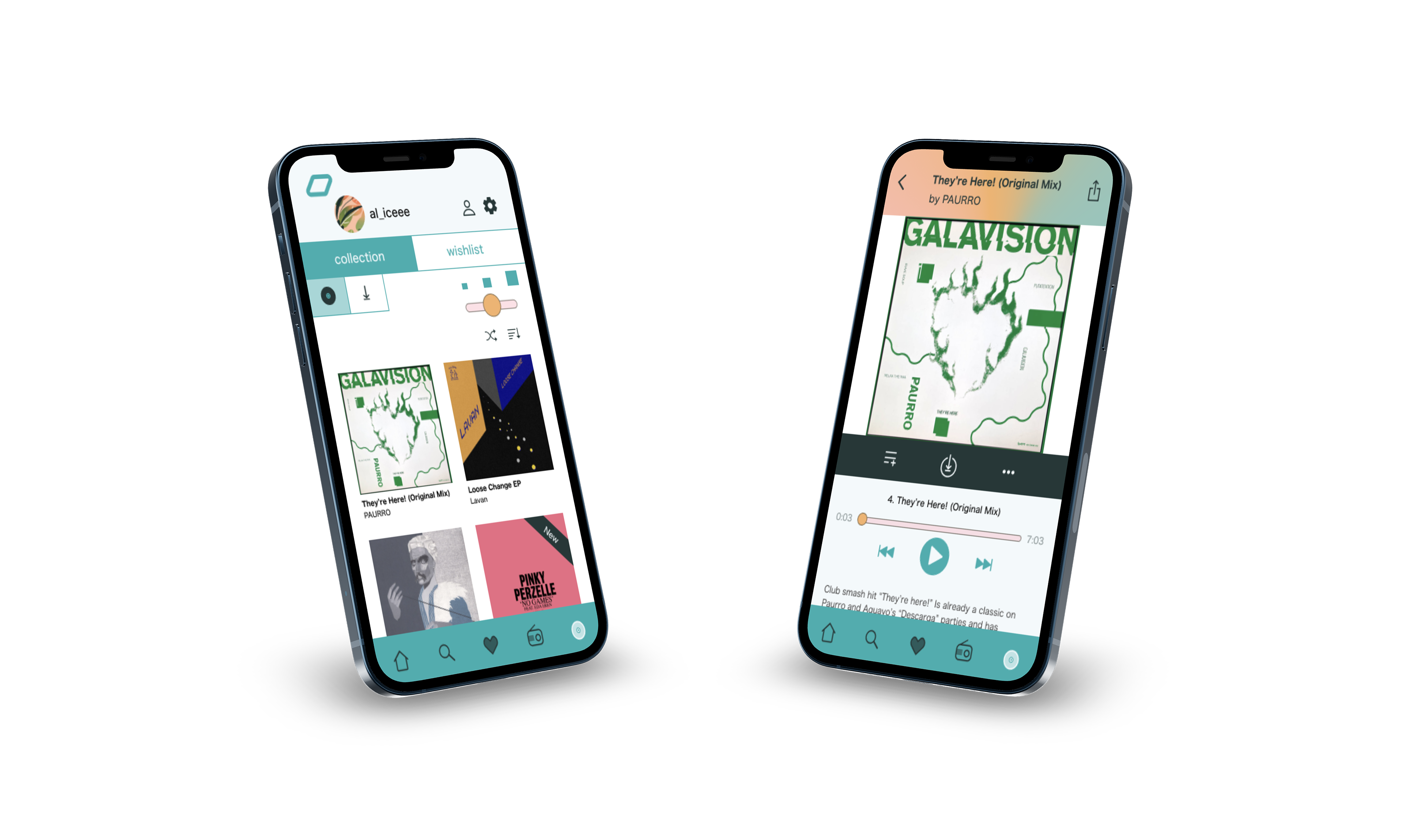
Screens Redesign
Then it was time to redesign the chosen screens, implementing the new style and thinking about ways to improve the issues highlighted in the Heuristics Analysis.
I tried to incorporate the Atomic Design approach, making components where useful and components nested in larger components.

Design Critique Feedback
I got a lot of helpful feedback in the design critique! People liked the colour palette, but felt like the contrast wasn’t enough in some places, like the genre chips for example, which I’d previously had in the gold-peach colour. Therefore, I changed these to the black colour instead.
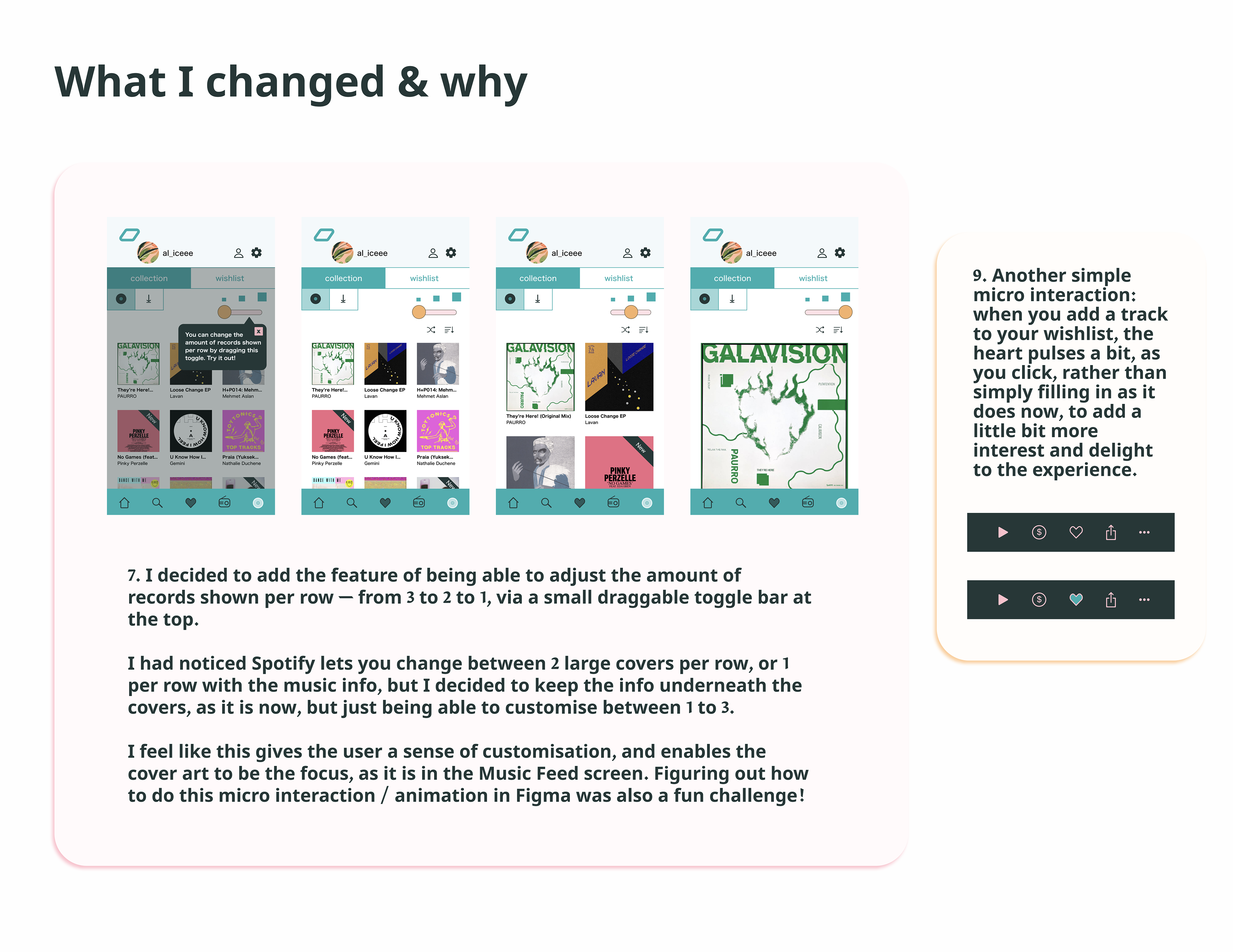
Also, they felt like the toggle bar for changing the amount of records per row was too small for a phone screen, so I increased the size of that.
Prototype
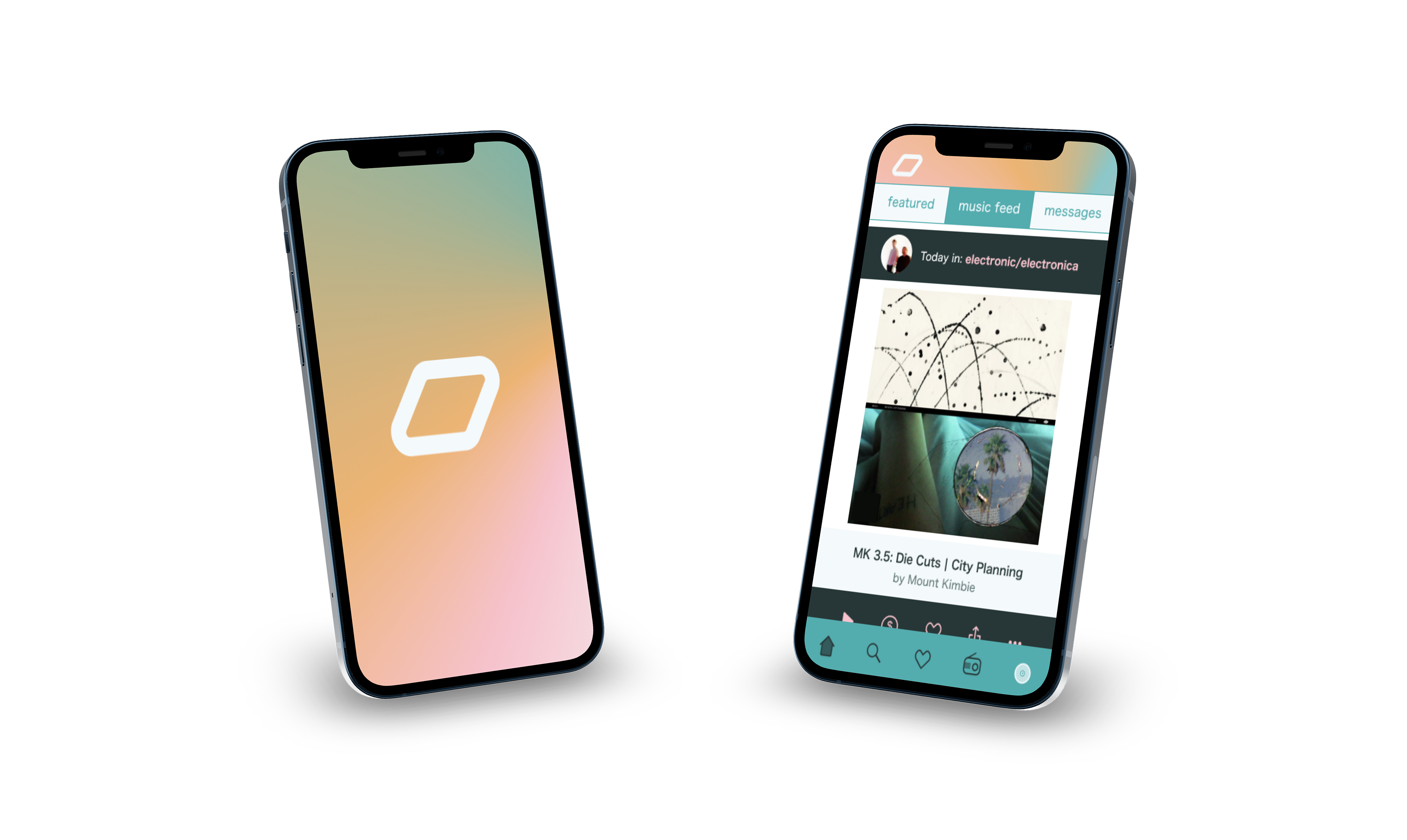
Here you can see a video of my prototype in action! Post the design critique I also implemented a splash screen, which was a great way to practice Smart Animate in Figma more.

