Rootling App: Making free-time more enjoyable
Time: 10 days
Team: Thaís Lima & myself
Client: The Daily Health Conference (fictional competition)
Brief: How can people adopt and commit to a health-improving routine?
Deliverable: Hi-fidelity MVP native app prototype
Scope: Enabling users to set and track goals related to one aspect of wellness.
Tools: Figma, Figjam, Google Forms
Background
For this project we used the Design Thinking process, and after an initial chat about what possible topics we could work on, we were excited to discover that we share an interest in the topic of “doing nothing” — ie disconnecting during free solo time. After some initial secondary research, Thaís came upon the term “Conscious Idleness” which I hadn’t heard before, and I think is really fitting for this topic!
Assumptions and Secondary Research
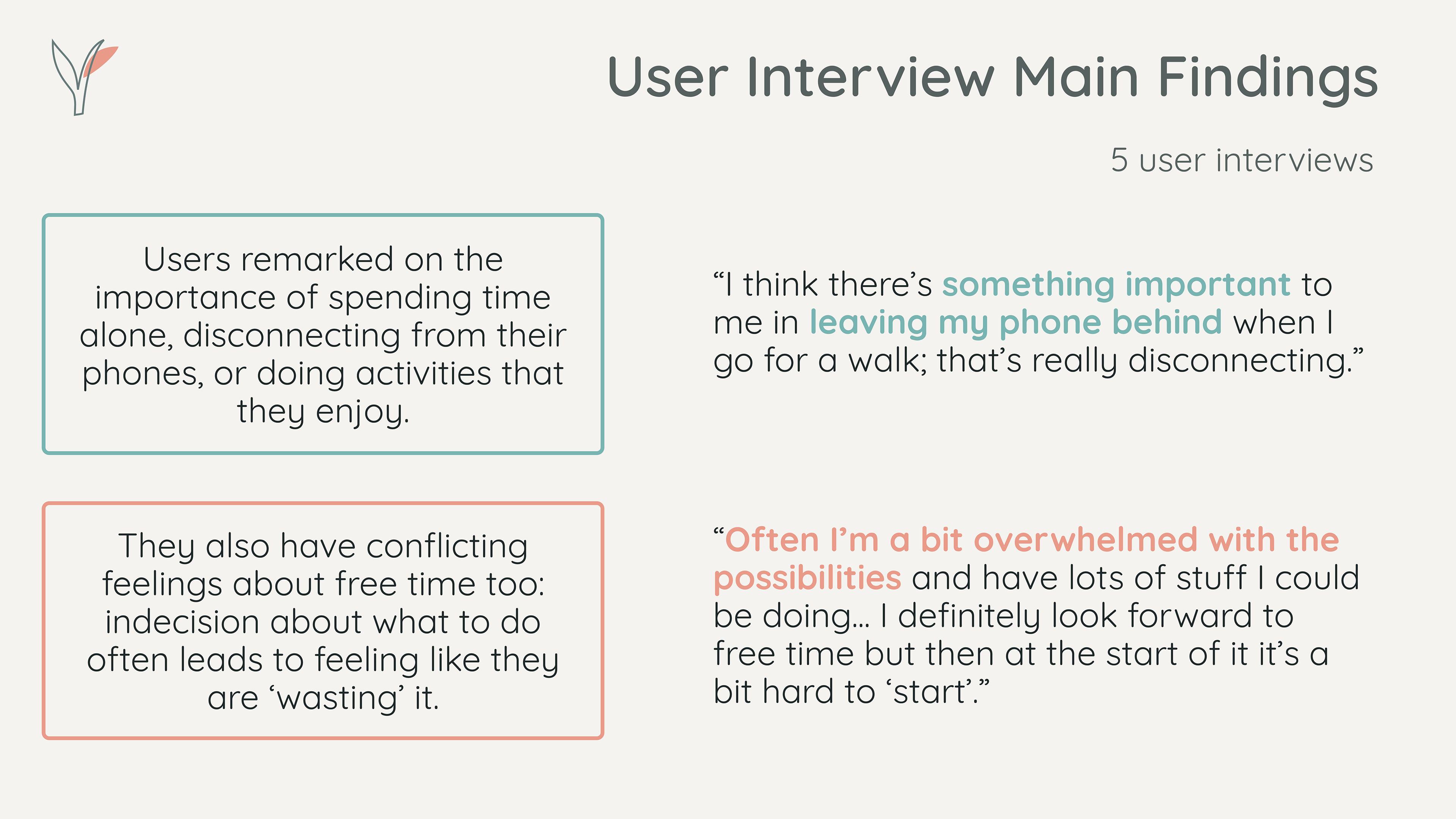
We initially thought people might be having problems integrating enough solo downtime into their daily lives, due to time spent “doing nothing” being thought of as “lazy” or “wasted”.
Secondary Research in neuroscience revealed that there is the possibility of more creative potential if we lead lives with a lot of downtime and leisure, instead of being constantly busy and “productive”.
Also that anxiety is often reinforced by trying to deal with uncertainty by checking your phone.
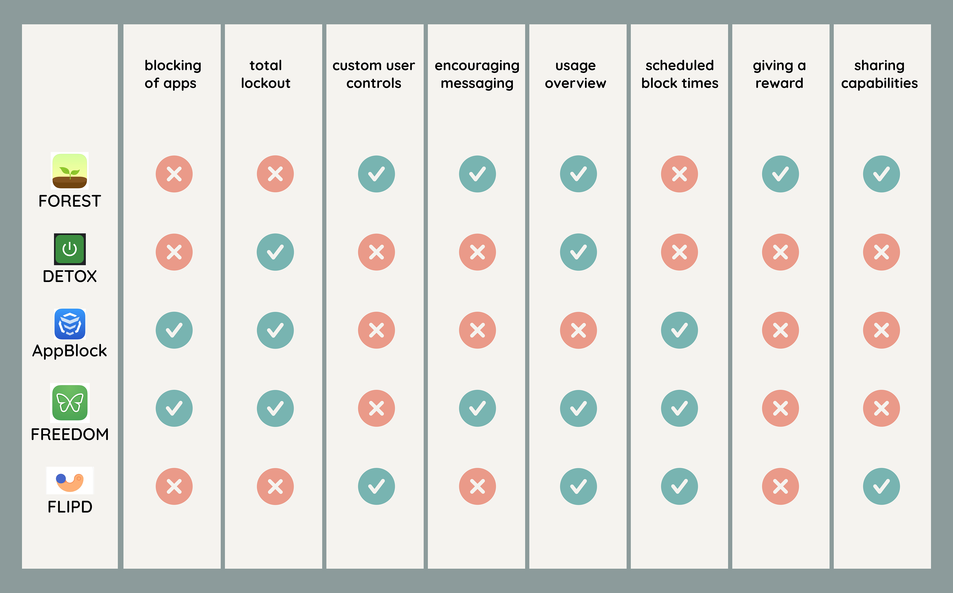
Competitor Feature Comparison
Competitor Analysis
As we thought the app we’d end up creating could be a variation of a phone usage control app, we looked at 5 of these apps on the market, to conduct a competitive analysis and feature comparison. It was also interesting to not only look at the app developer’s description of their apps, but the user reviews too, to get a good handle on what features they do and don’t have.
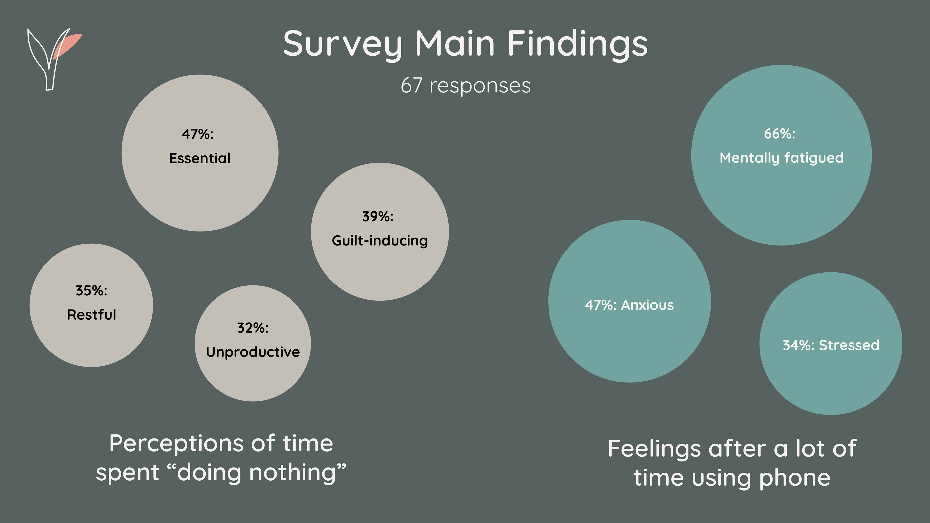
Quantitative Data
We put together an online survey to collect some quantitative data, and to help inform our next step of research which would be user interviews.
Almost half of the respondents chose “Essential” while almost 40% chose “Guilt-inducing”. “Restful” and “Unproductive” were both chosen by around a third of respondents.
These contradictory sentiments highlighted something to dive deeper on in the next step of research.
Two-thirds of respondents saying they feel “Mentally fatigued” also highlighted to us the impact of phone usage on people’s potential rest.
Qualitative Data
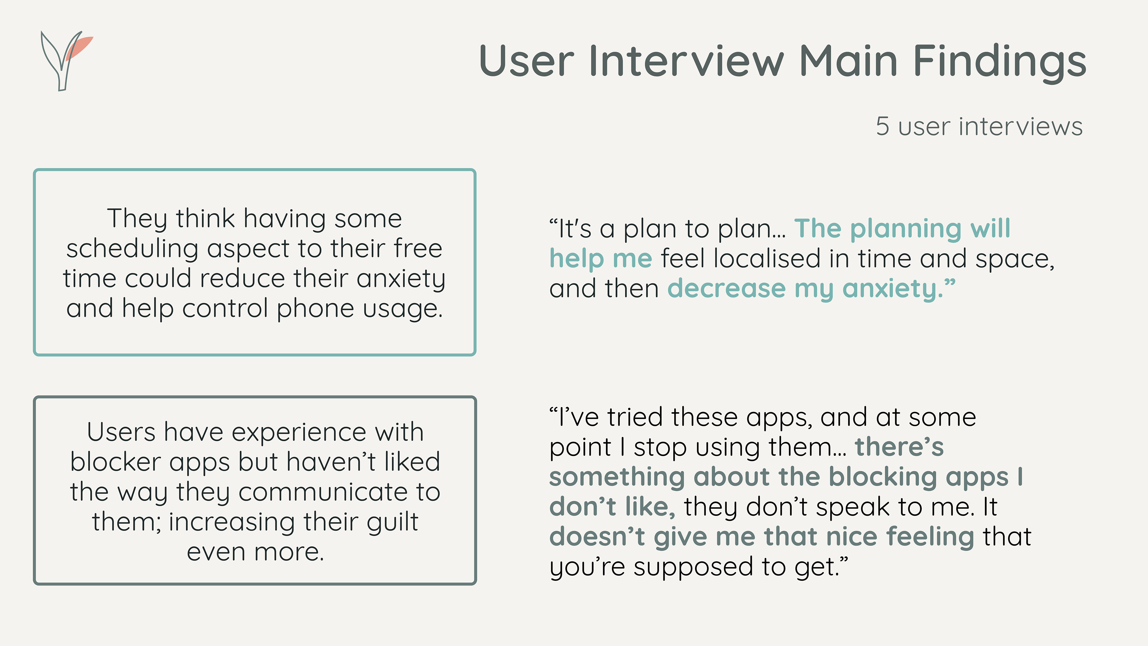
We interviewed 5 people to go deeper on the topics of free time, disconnecting, productivity, mobile phone usage, and what “doing nothing” means to them and how easy they find it to do. We both found the talks so interesting and after clustering all of the quotes, the following patterns emerged as the main insights.
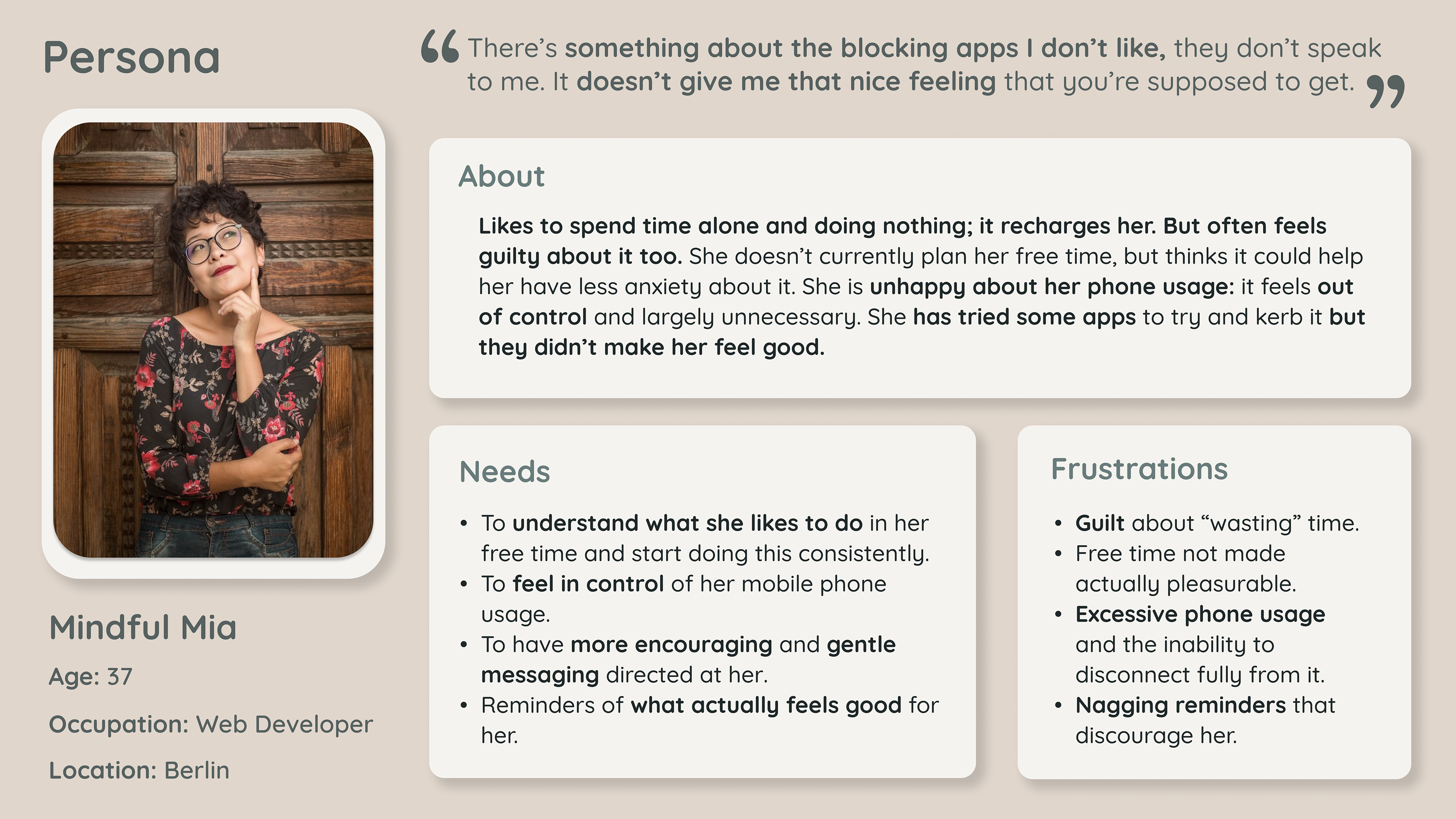
User Persona & Journey Map
Synthesising the interview data and deciding on which were the most important and interesting main insights to focus on helped us to in turn create our User Persona, Mindful Mia.
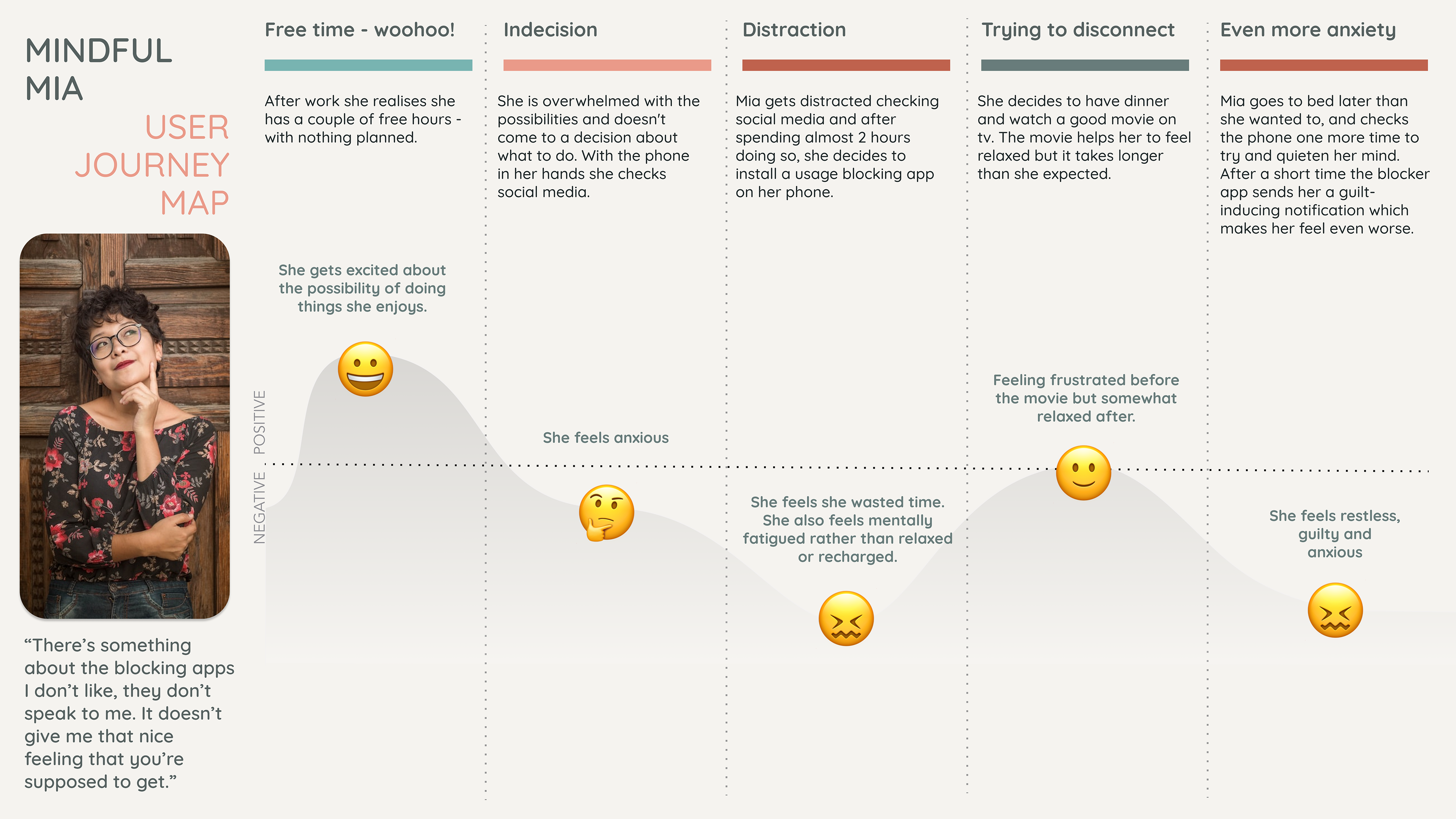
We then mapped out a scenario for Mia, which you can see in our User Journey Map.
In this scenario we spotted 3 key opportunities which were:
- How Might We help Mia to reflect on and decide what to do in her free time?
- How Might We empower Mia to spend her free time in a more pleasurable way?
- How Might We remind her in a gentle way to reduce her unnecessary phone use?
And these led us to create our Problem Statement, which is:
Self-reflective millennials need an empowering method to encourage them to use their free time in a fulfilling way, because they currently feel anxious and guilty about wasting a lot of time, especially on their mobile phones.
Ideation & MVP Feature Prio
Based on our problem statement and Mia’s main needs, we decided to prioritse the following features in our MVP prototype:
- Users can reflect on and specify what activities they like to do and how said activities make them feel.
- They can then be encouraged to start a relevant activity when they have been using their mobile phones for a designated amount of time.
- They will be further encouraged by a weekly stats overview.
By providing these features, users will have less moments of feeling overwhelmed in their free time, and also feel more supported in controlling their mobile phone usage.
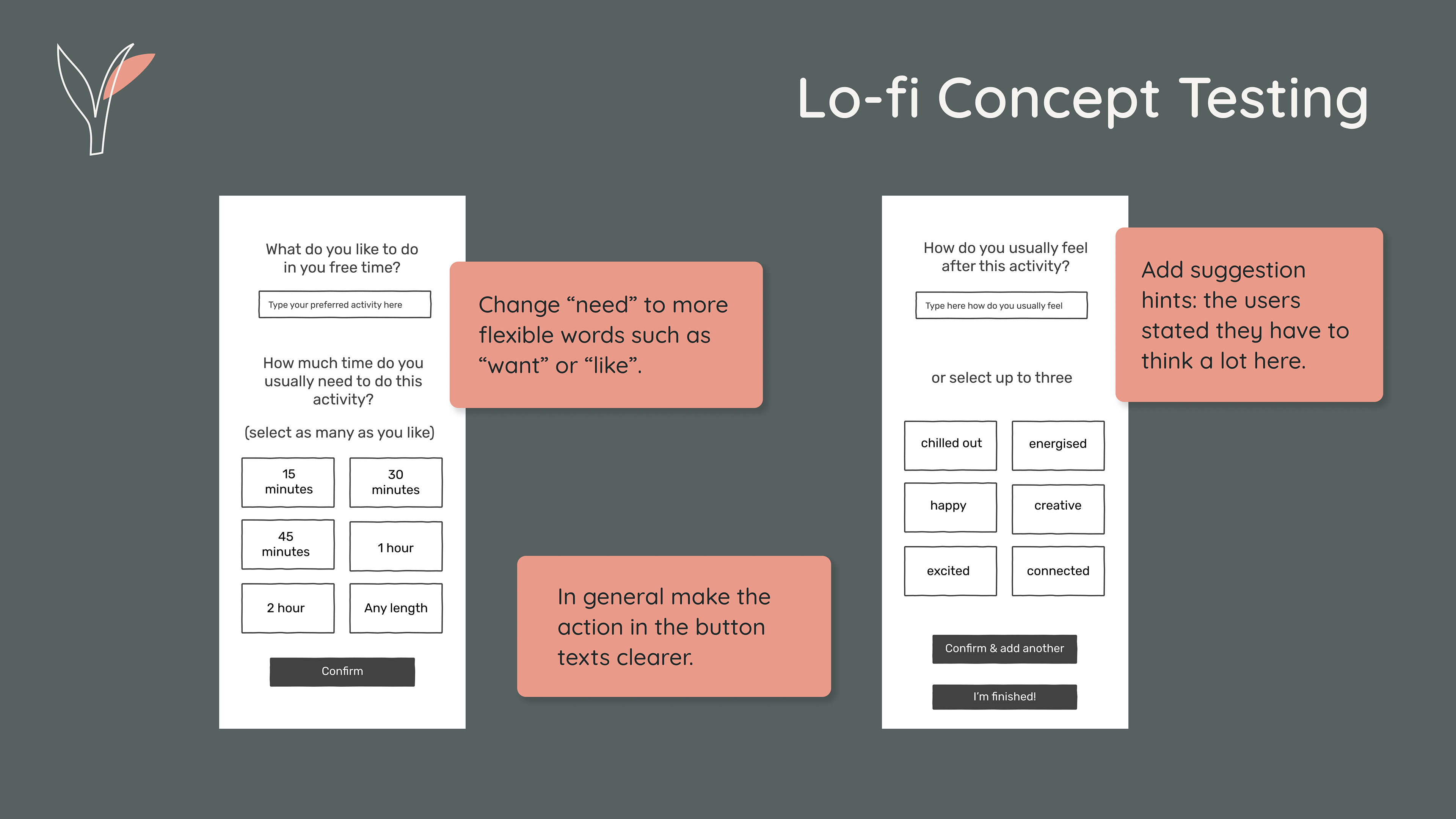
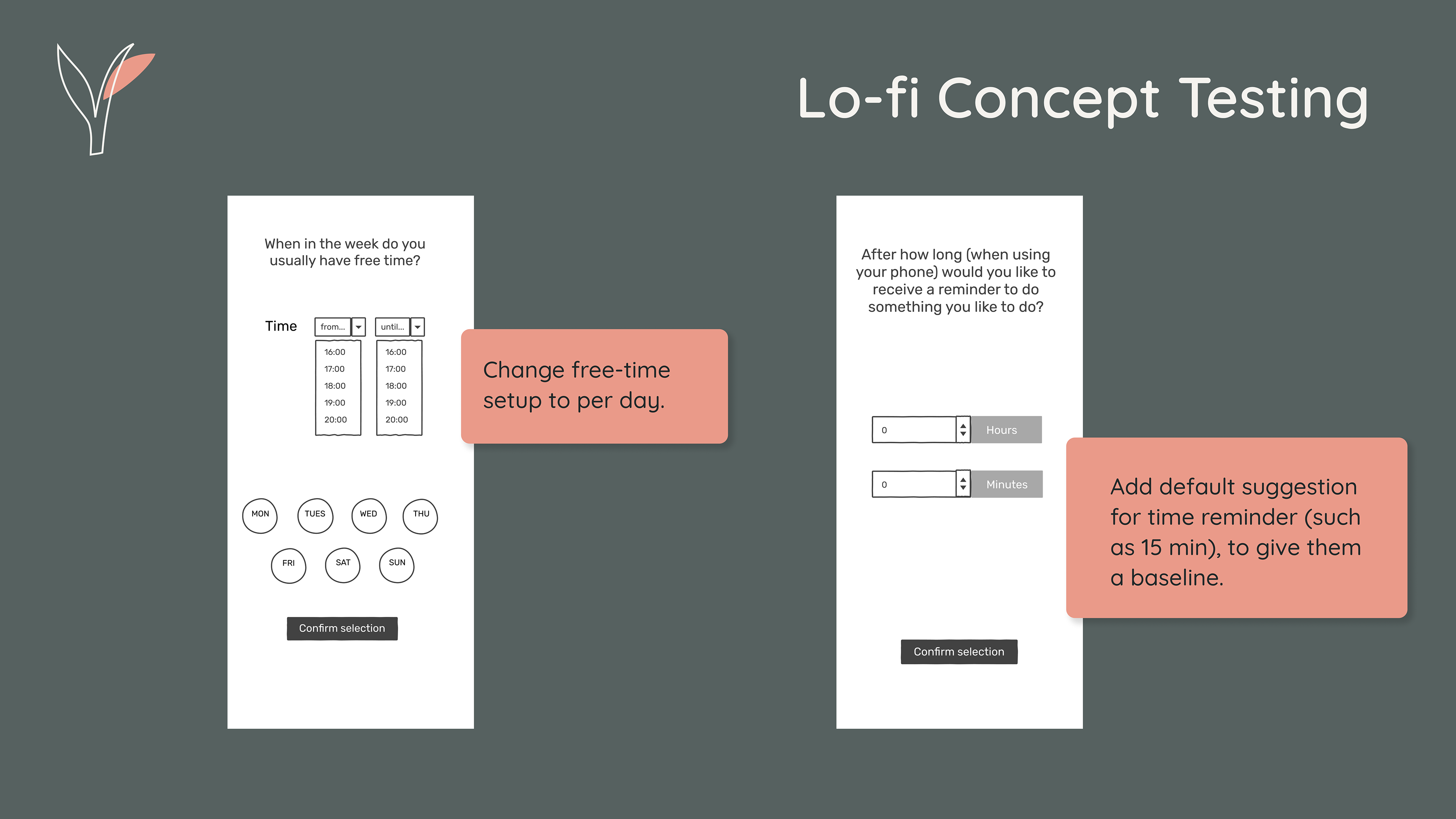
Lo-fi Wireframes & Concept Testing
We put together the bones of a flow and the necessary screens, prototyped them and then we were ready to concept test!
Concept tests went well: it became clear that we maybe added too many specific wordings for a Lo-fi — people were getting quite hung up on the wording and it strayed into usability testing a few times, however also for our concept the wording is very important, so it was also good to get feedback on the wording even at this stage.
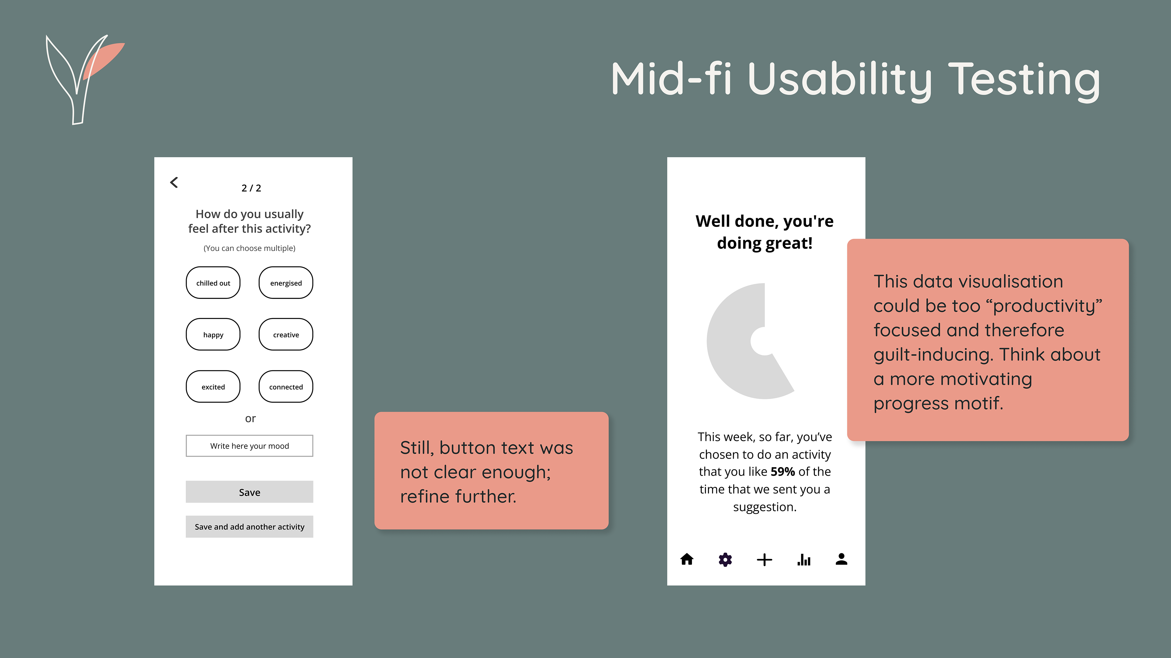
Mid-fi Wireframes & Usability Testing
We integrated this feedback into our Mid-fidelity iterations, and then conducted usability testing, which again was really helpful. We were happy to even hear some users say that they would actually like to use the app!
Brand Identity
We conducted a Visual Competitive Analysis, looking at the apps we’d already done a feature comparison for, as well as some apps focused on scheduling, just to compare. This was helpful for us, as a main insight from our research is that users are not happy with how these blocker apps communicate to them, which is partly influenced by their brand voice and look and feel.
We decided on a set of 5 Brand Attributes which were:
- Simple, Gentle, Encouraging, Joyful & Natural
We put together a mood-board that evokes these adjectives, tested it, and then from that pulled out a colour palette for our brand colours. We put together some test swatches and overlays to see how they interacted with each other and to check how the contrast was. Once we settled on a palette, we put it into a couple of screens to see how we liked it, but by the next morning, as we started to implement it in further screens we realised we found the colours to be a little unsophisticated, and not as gentle as we were going for.
So, we tweaked them: changing the rose colour to a more coral tone, and the pistachio-green to a more teal colour; added some other neutrals, such as a new grey-blue colour, and a secondary beige colour to add some more depth to the screens where needed; and ended up with a palette that embodied our vision and attributes much more.
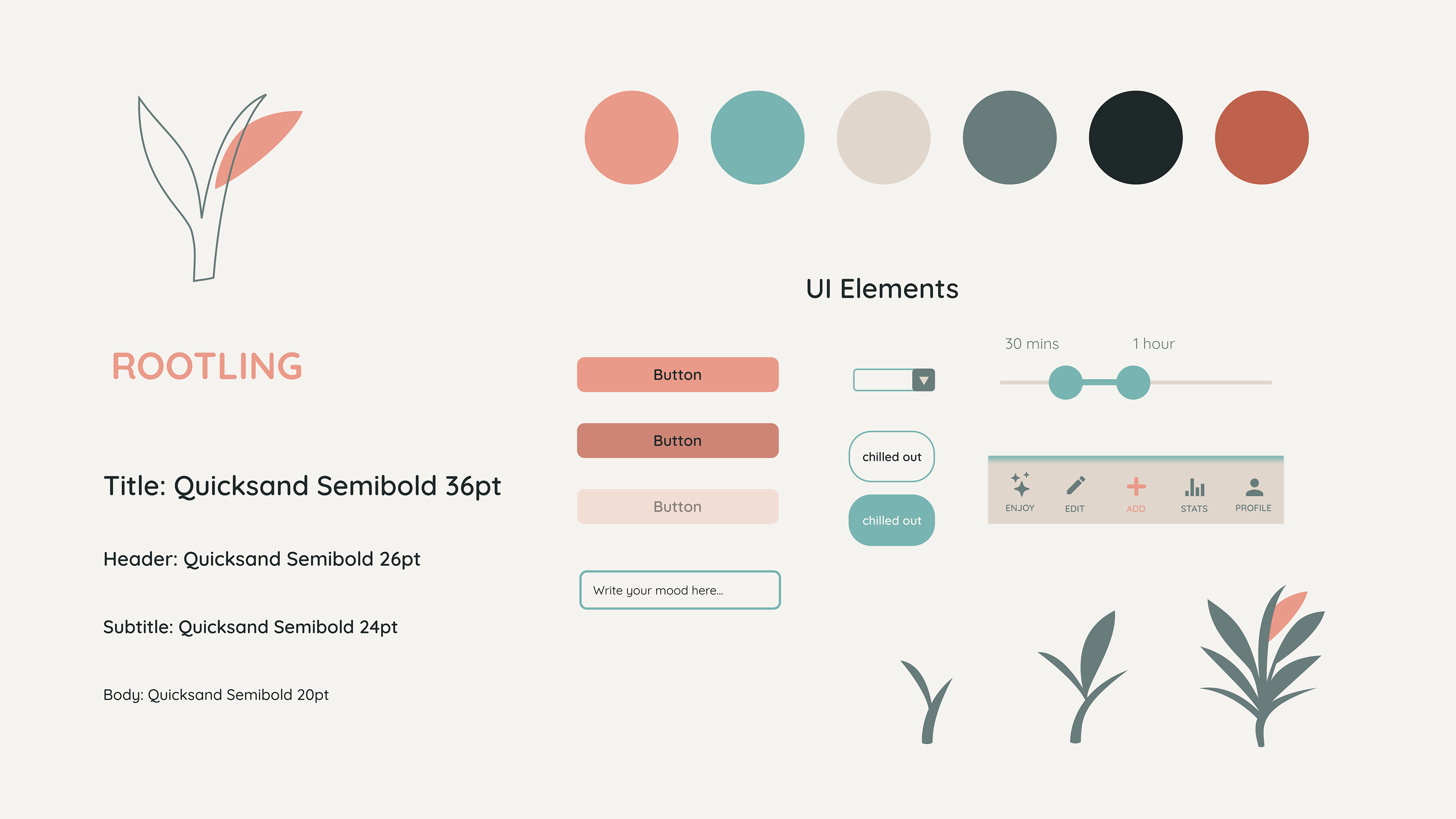
UI Elements
We chose some typography, and styled some UI elements. We also created a different motif for the stats, of a growing leaf, with 10 different stages of growth to correspond to progress percentiles. This way, each week, the user will have a variation of a leaf to symbolise their progress, whether a small root, or a full grown plant that has flowered, rather than trying to keep a continual plant or tree alive, which was a concept we had come across in competitors.
We felt that a dying plant or tree would embody this guilt-inducing messaging that we were attempting to reverse with our concept. So here, the plant is always living, and in fact, by resetting the stats each week, the user would end up with a “collection” of plants.
We tested this concept with potential users to get some feedback and it was received well!
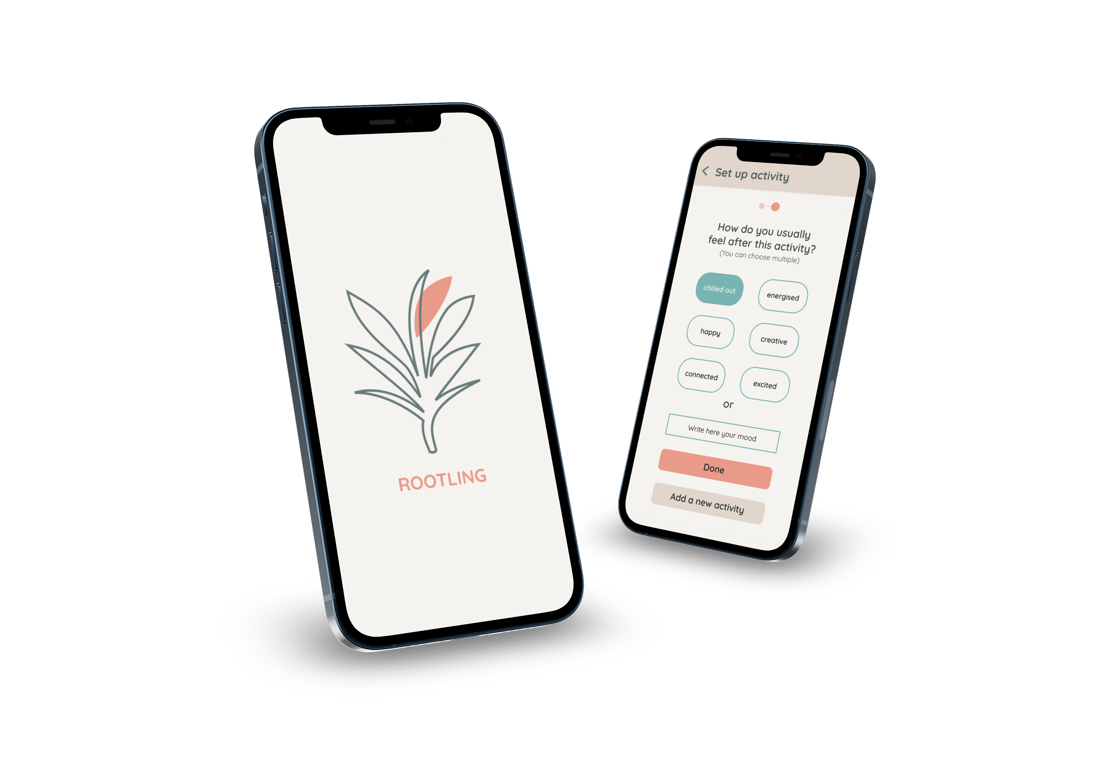
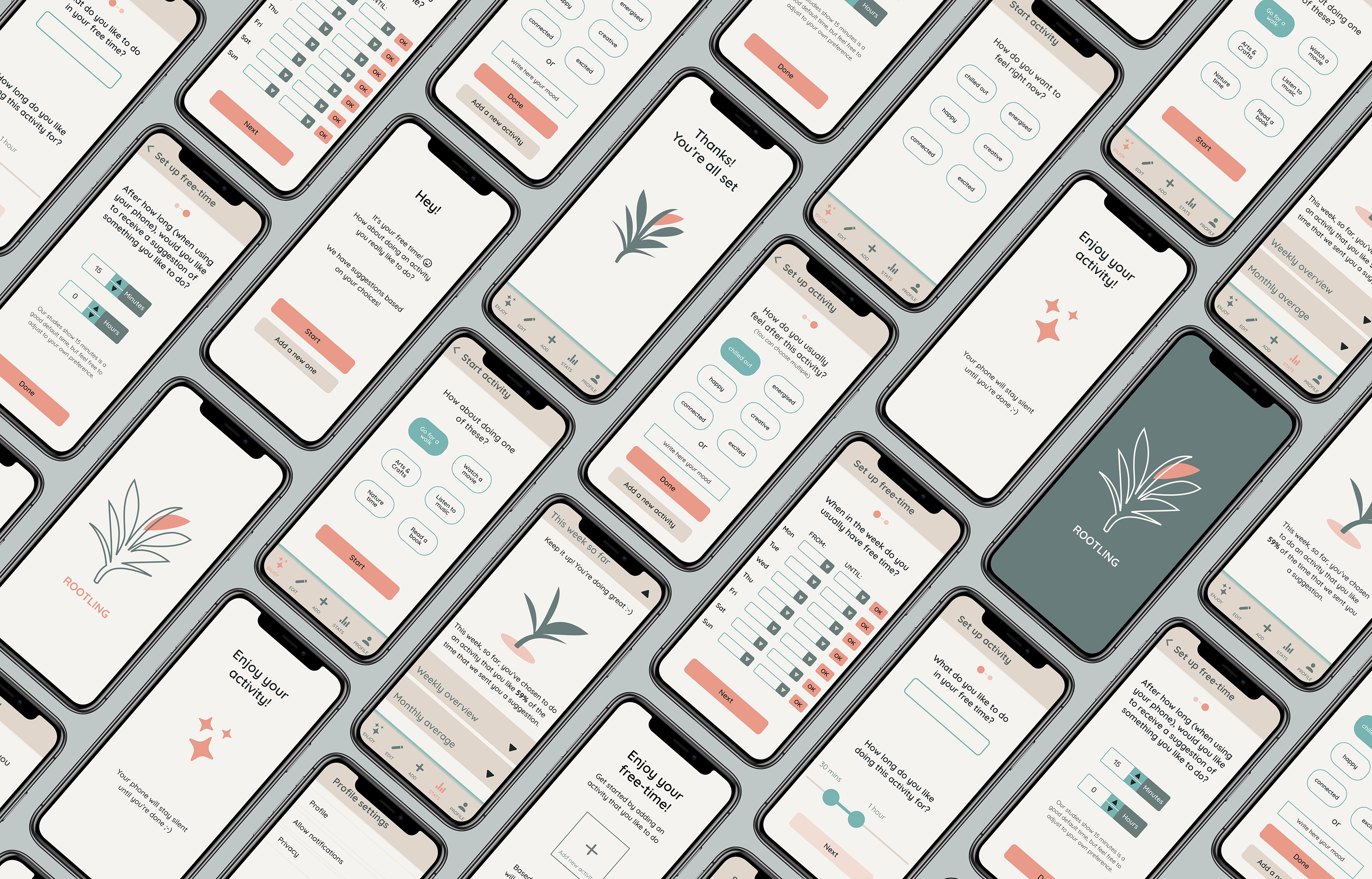
Hi-fidelity Prototype
With the style defined, and the leaf motif animating between it’s growth-stage-variants, it was time to finalise our Hi-fidelity prototype!
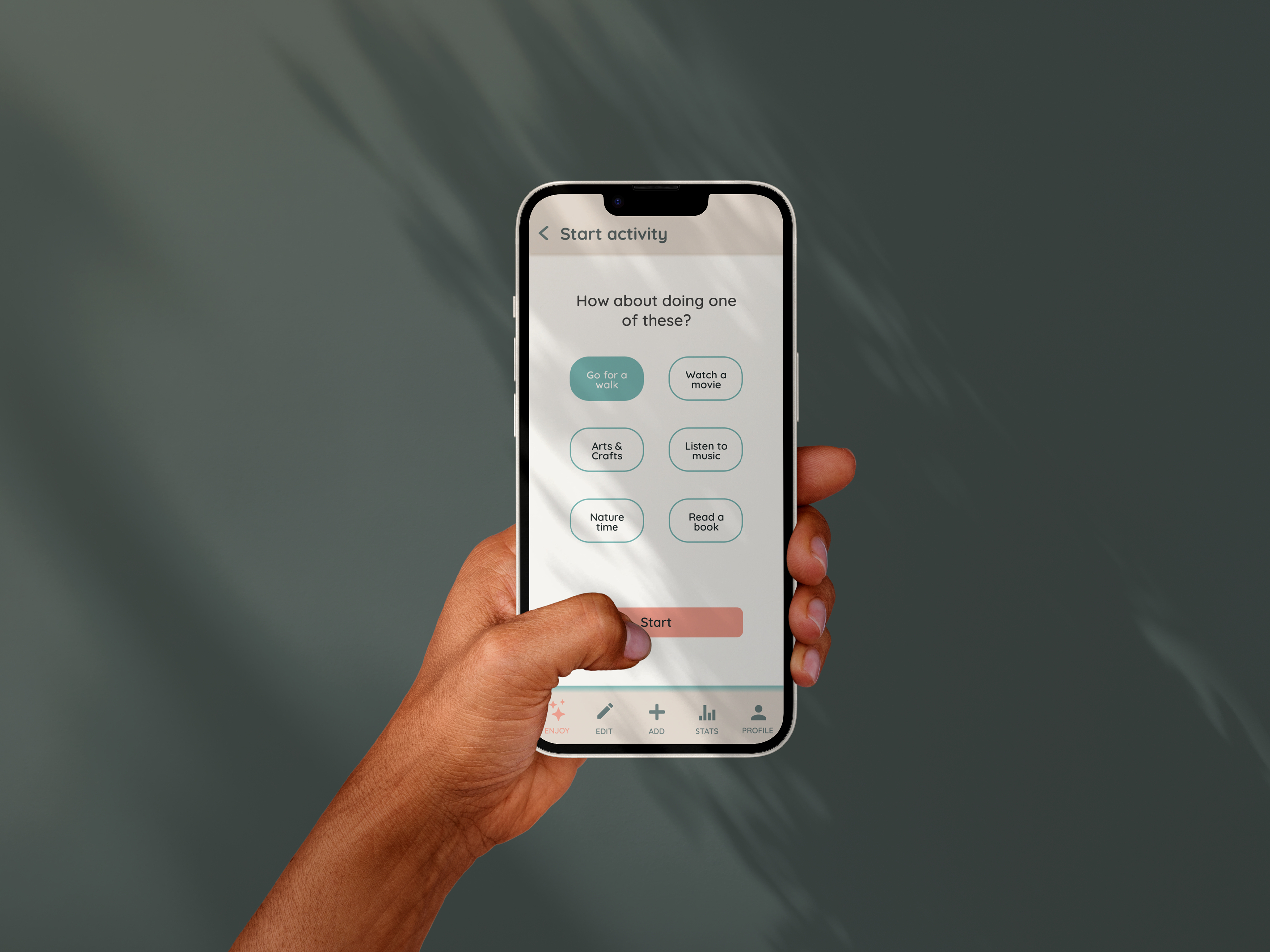
We prototyped two main user flows for the MVP, as part of the “must-haves” for the brief were related to setting up goals, as well as being informed about usage of personal data.
1st Flow
The first flow is the setup of activities, free-time settings, and the “suggestion” notification settings.
2nd Flow
The second flow is a user actually receiving a suggestion to do an activity and following through with that.
We were both really happy with how this MVP prototype turned out, and feel like we created a concept that provides a valid solution to our defined problem.
Our Solution in a few sentences:
An app that encourages users in gentle language to reflect on what they really like to do in their free time. It helps them to avoid unnecessary phone usage, by sending them suggestions of activities, custom to their feeling, in the moment.
Accessibility and Desirability Testing
With our MVP prototype ready, we conducted some accessibility testing with a plugin in Figma called “Color Blind”, to check how the screens looked with various vision conditions, and were happy that the contrast was still strong enough.
We also conducted some desirability testing with the style tile and a few screens. 2 of our 5 direct Brand Attributes (Natural and Gentle) were in the top 5 chosen responses out of 50, which we found positive. We were also happy with the “Calm” and “Clear” responses that we felt echoed our “Simple” attribute.
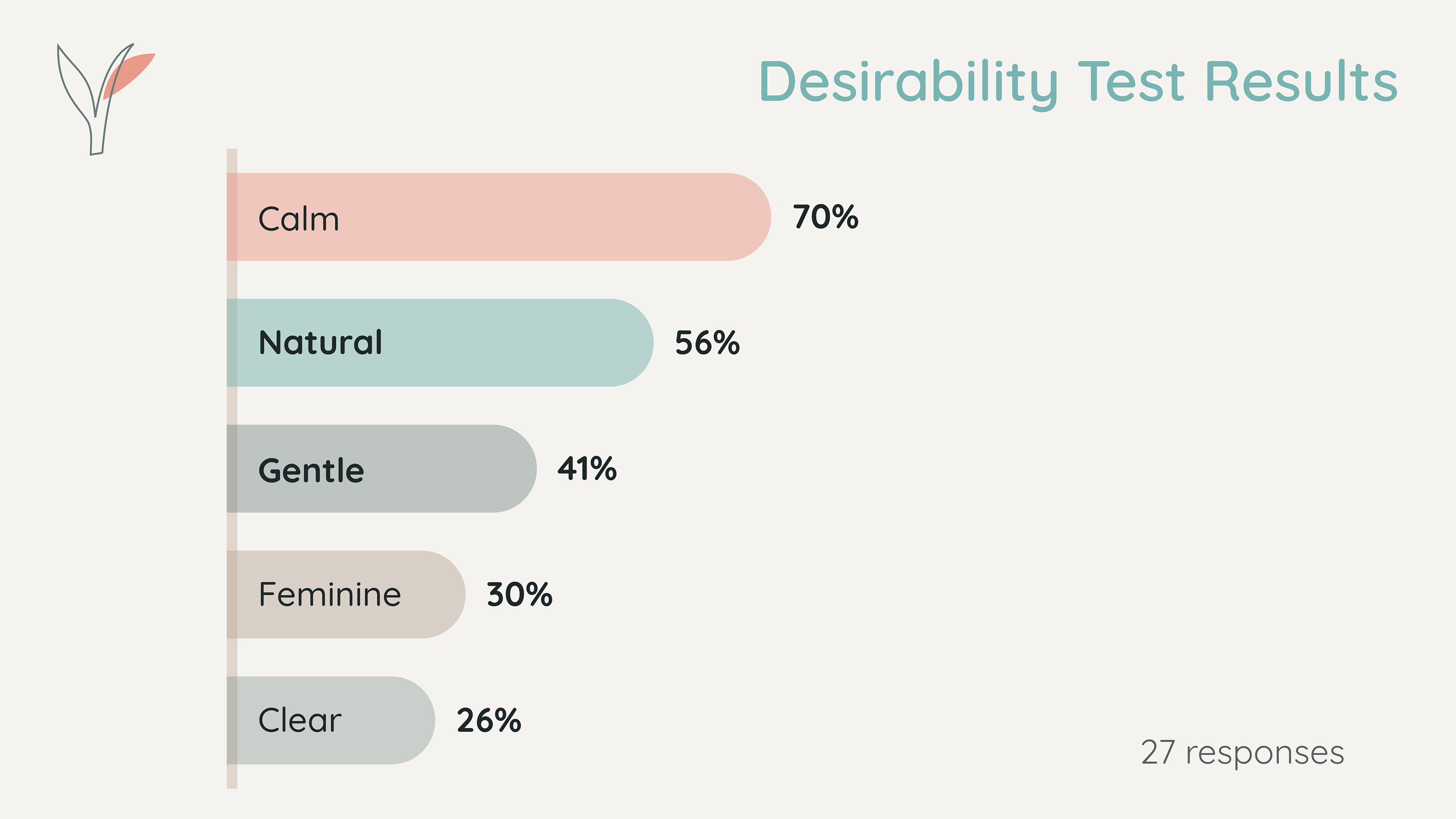
Our attributes of “Joyful” and “Encouraging” were only chosen by 11% and 7% of respondents respectively, however, as we asked them to focus on the style, look and colours of the designs only, we were not too perturbed by these results.
We feel that these attributes are more related to the concept and voice of our app, rather than the style. However, the style and voice still go hand in hand, so this could be something to iterate on further, should we have had more time for the project.
Finally, the fact that 30% of respondents chose “Feminine” was interesting to us, and made us think about whether we should actually even include gender-based terms in our test or not, especially if it’s not something we are trying to embody in our concept, as these are such subjective terms. So this was definitely something to think about for future projects.
Next Steps
Should we have had more time for this project, we would have worked on the following next steps:
- Validate the MVP with more ‘real’ users, in simulated ‘real’ scenarios: a user during a concept test pointed out that while they really liked the concept and felt like they would probably use such an app, it was hard to gauge its success when not in the actual real moment.
- Gradually test and implement current ‘could-have’ features such as the possibility for users to tell the app how they felt after completing an activity, or making the silent feature more custom to their preferences.
- Ideation of further features as we go through the Design Thinking process again.
Some Key Learnings
The genius of the Design Thinking process: At the beginning of the project, we had no idea what our defined problem would be, nor what a possible solution could be. It was really interesting to follow the process and let both be “unveiled” to us: this really highlighted the genius of the Design Thinking process to me, and I feel like we not only came upon a nuanced problem, but an interesting and innovative solution that I wouldn’t have been able to conceive of before starting.
The value of quick Lo-fi wireframes and concept testing: Getting a concept conveyed in screens quickly, to be able to simply test the concept with real users as soon as possible, is so valuable, and I now understand the point that spending too long on making these screens is a waste of time.
You can read the full-length case study over on my Medium article.

