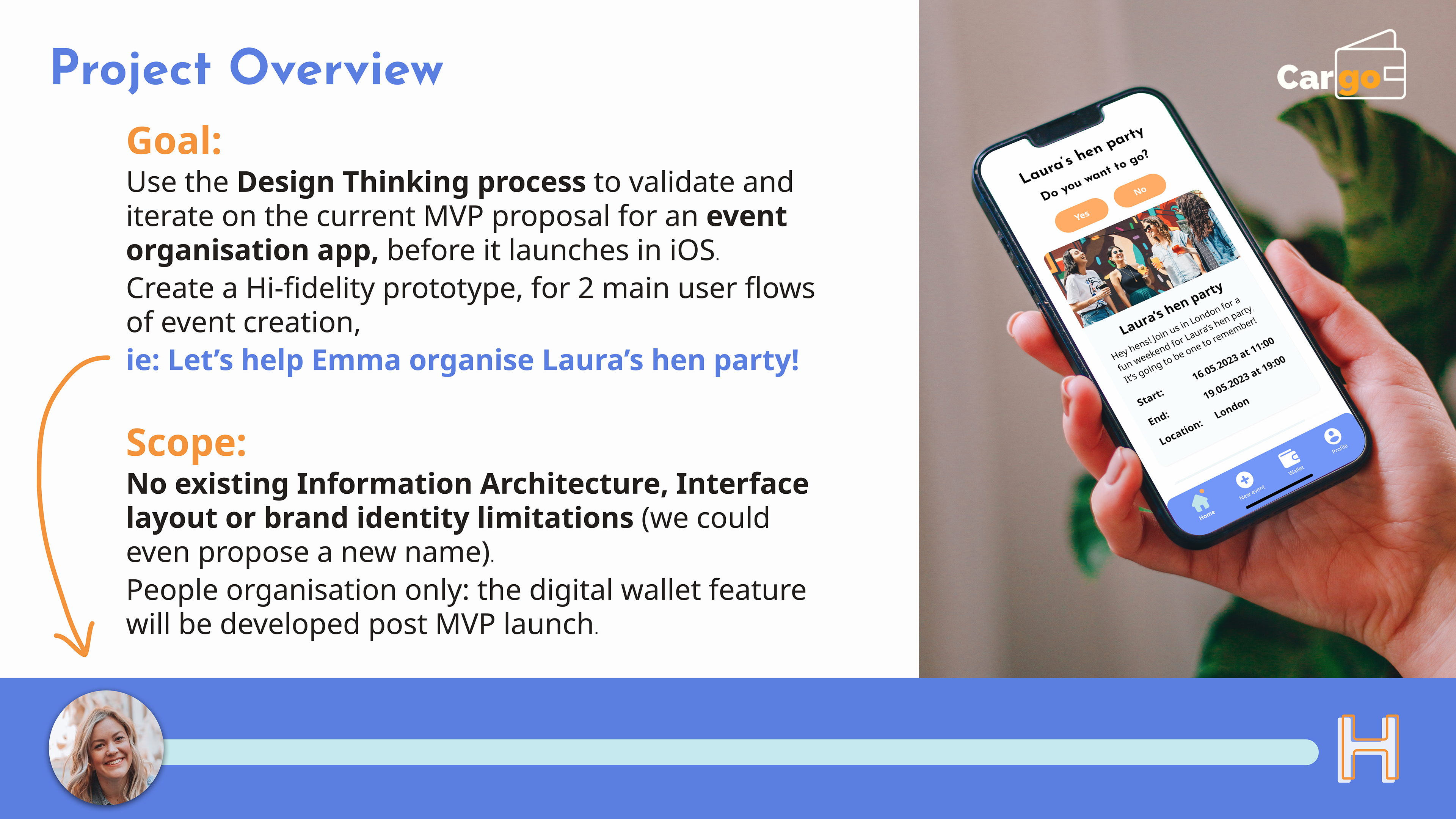
Cargo App: Validation / Creation of MVP Prototype & Rebrand
Client: Cargo App
Duration: 2 weeks
Tools: Figma, Figjam, Google Forms
UX Research, UX Design, UI Design: Nessrine Barkallah, Ray Zhang & Alice Moore
We each were hands-on across all facets of the project, and this case study is my personal take on the process.


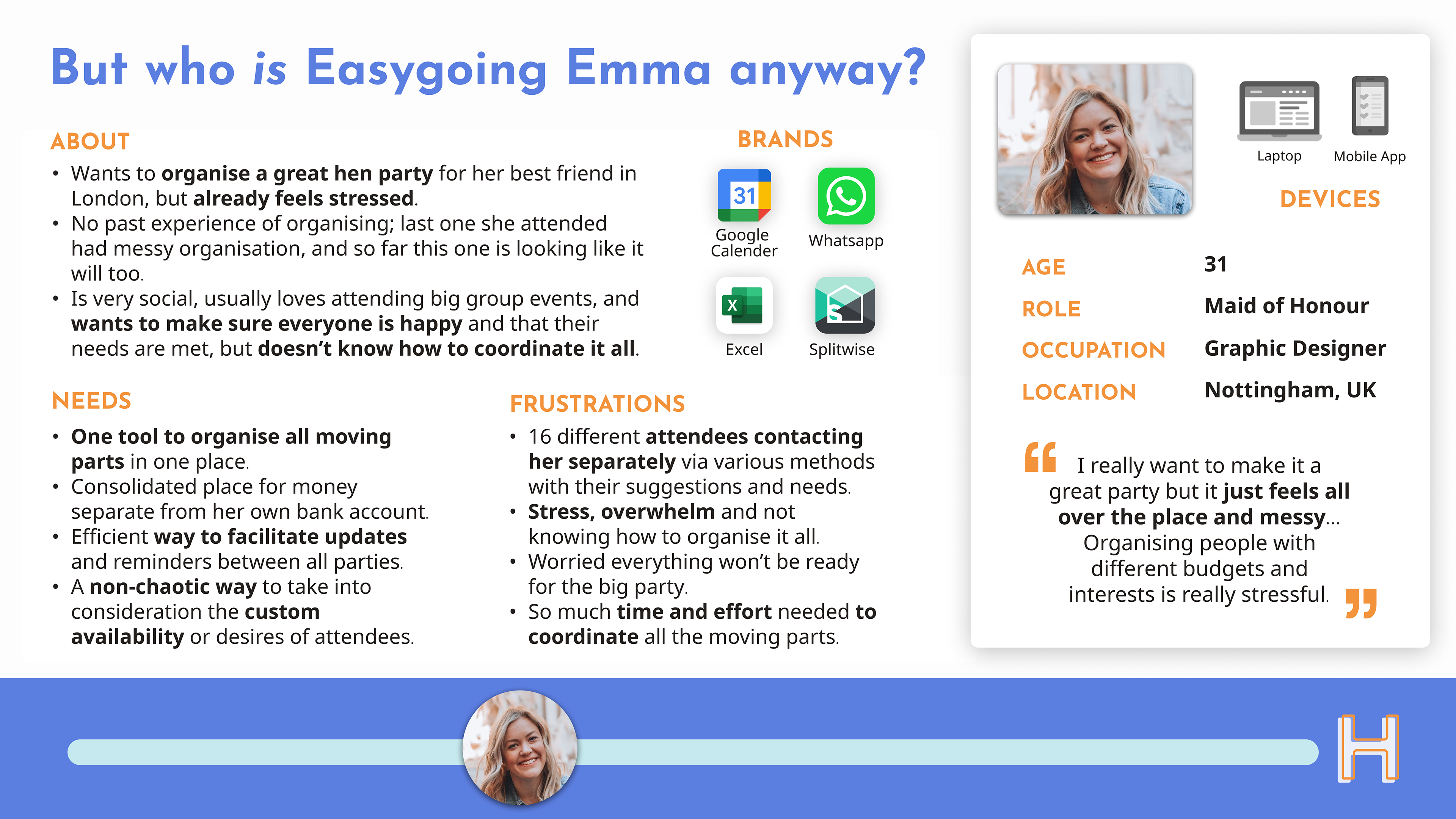
User Persona & Journey Map
These insights and clarification of user pain-points helped us develop our User Persona: Easygoing Emma.
All of the details apart from name, photo and location, came directly from our research insights.
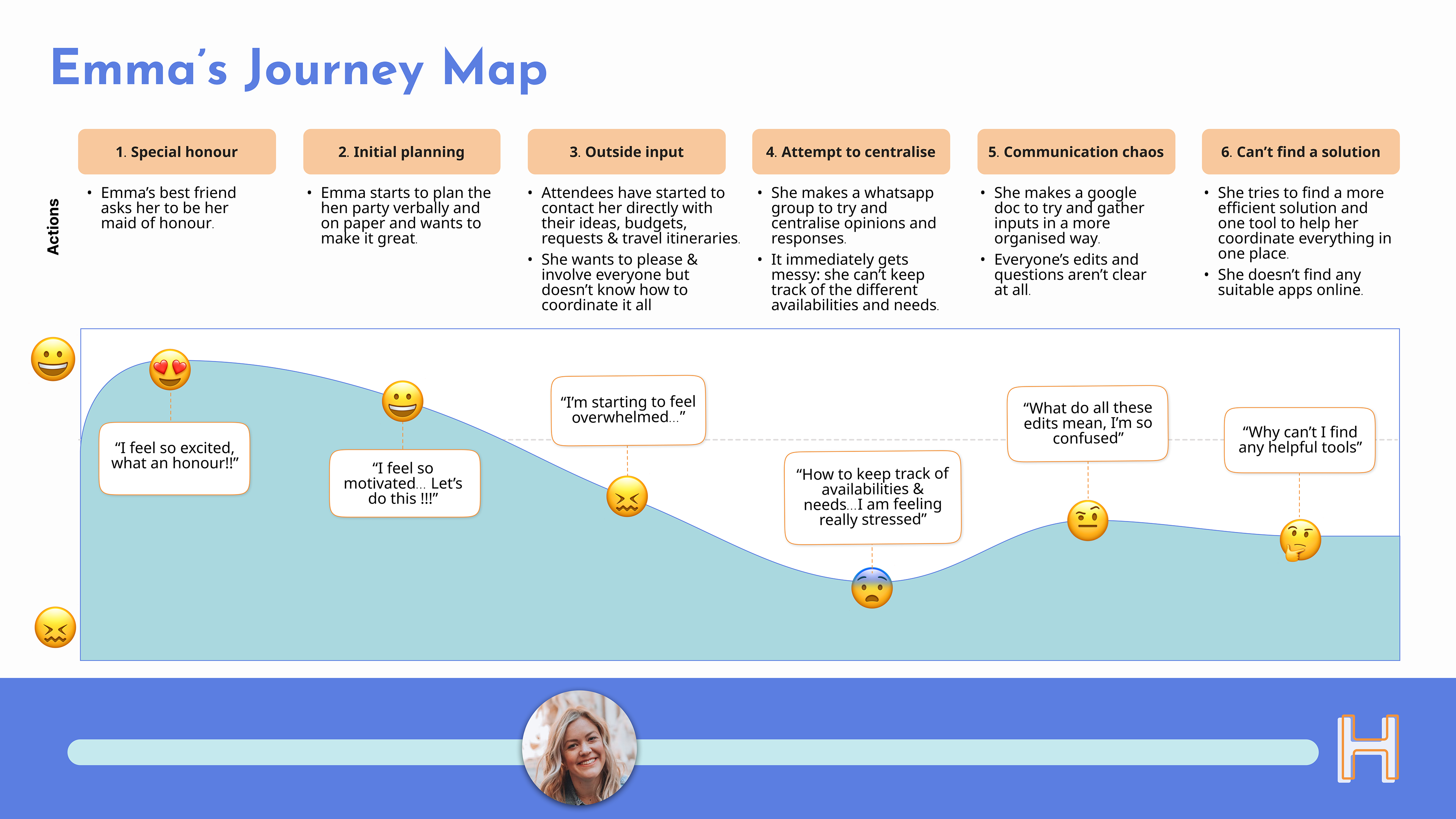
To give our persona even more context we also created a User Journey Map.
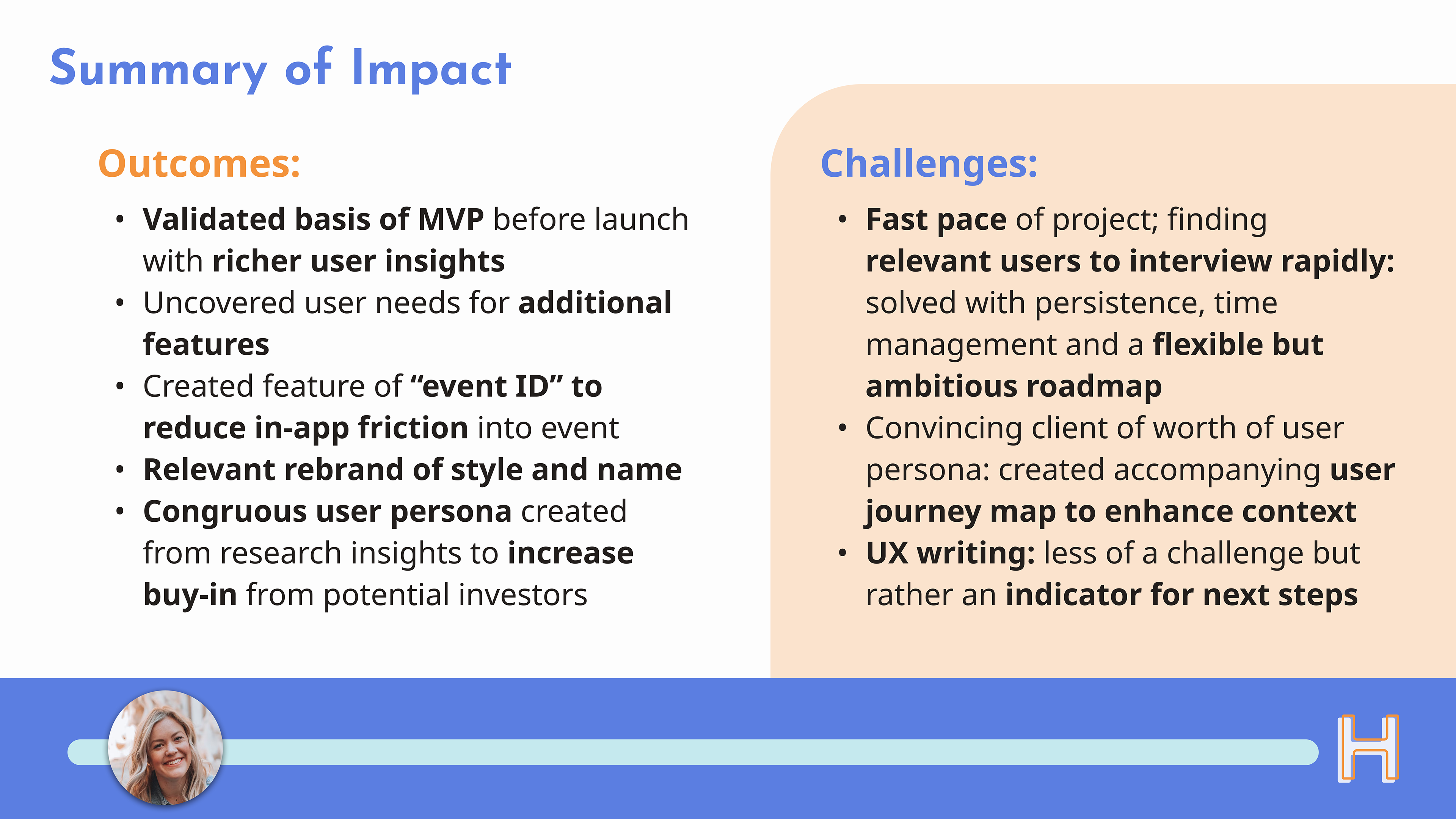
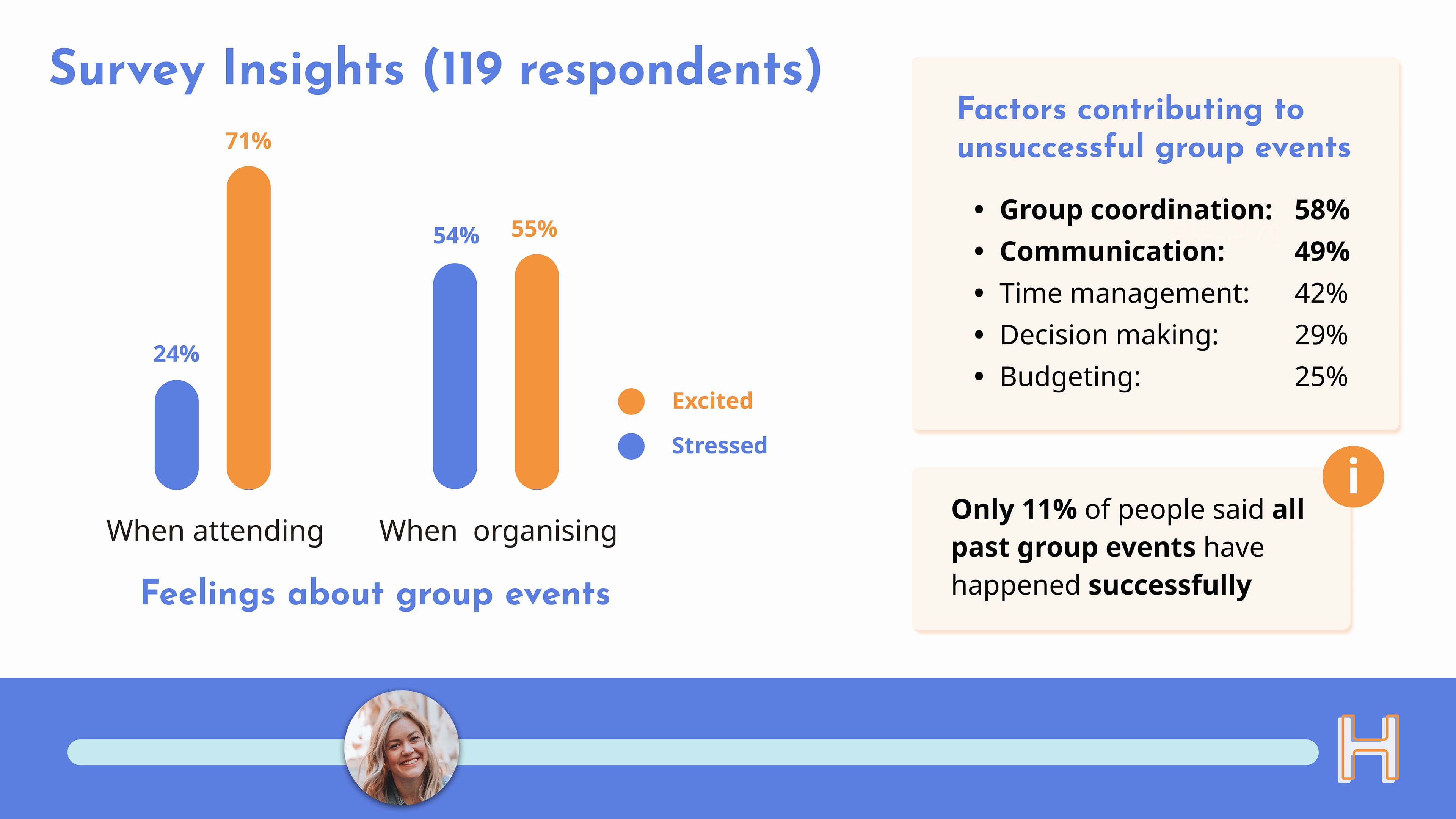
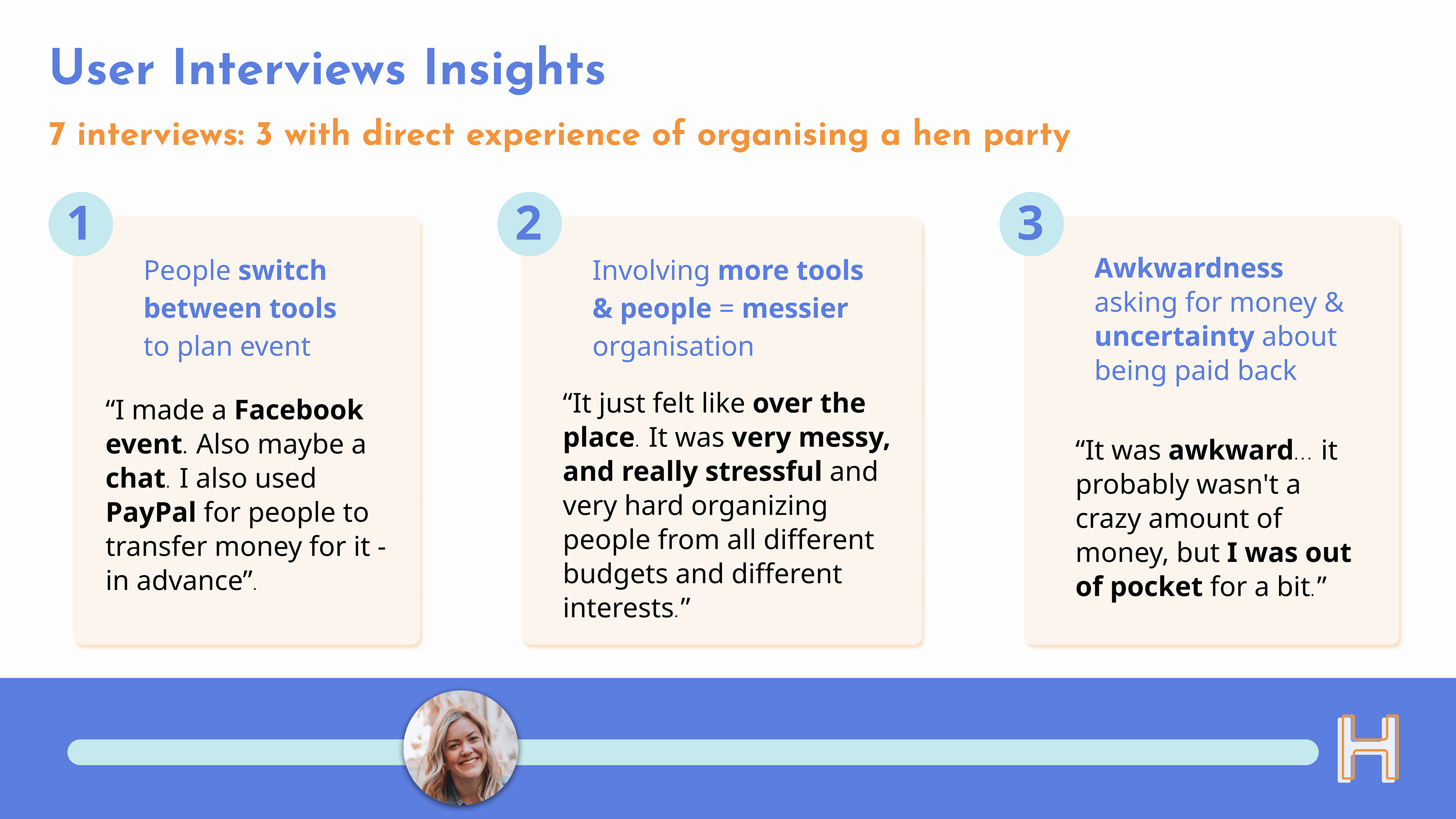
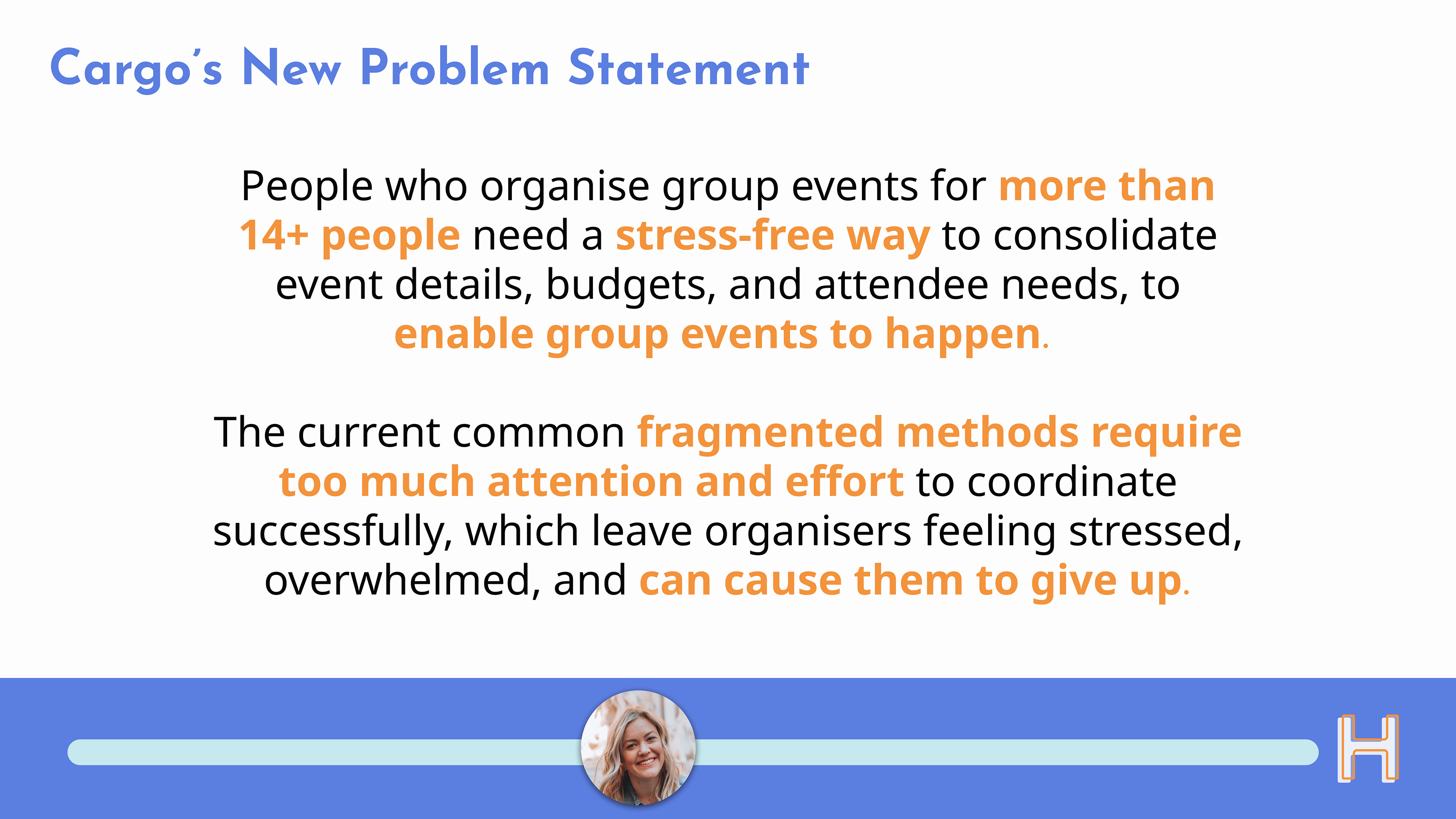
Synthesising all of the data highlighted the same pain-points as Cargo's research; thus the basis for their MVP proposal was validated. We created a new refined Problem Statement for Cargo, to help crystalise and emphasis this basis.
Ideation & MVP Feature Prio
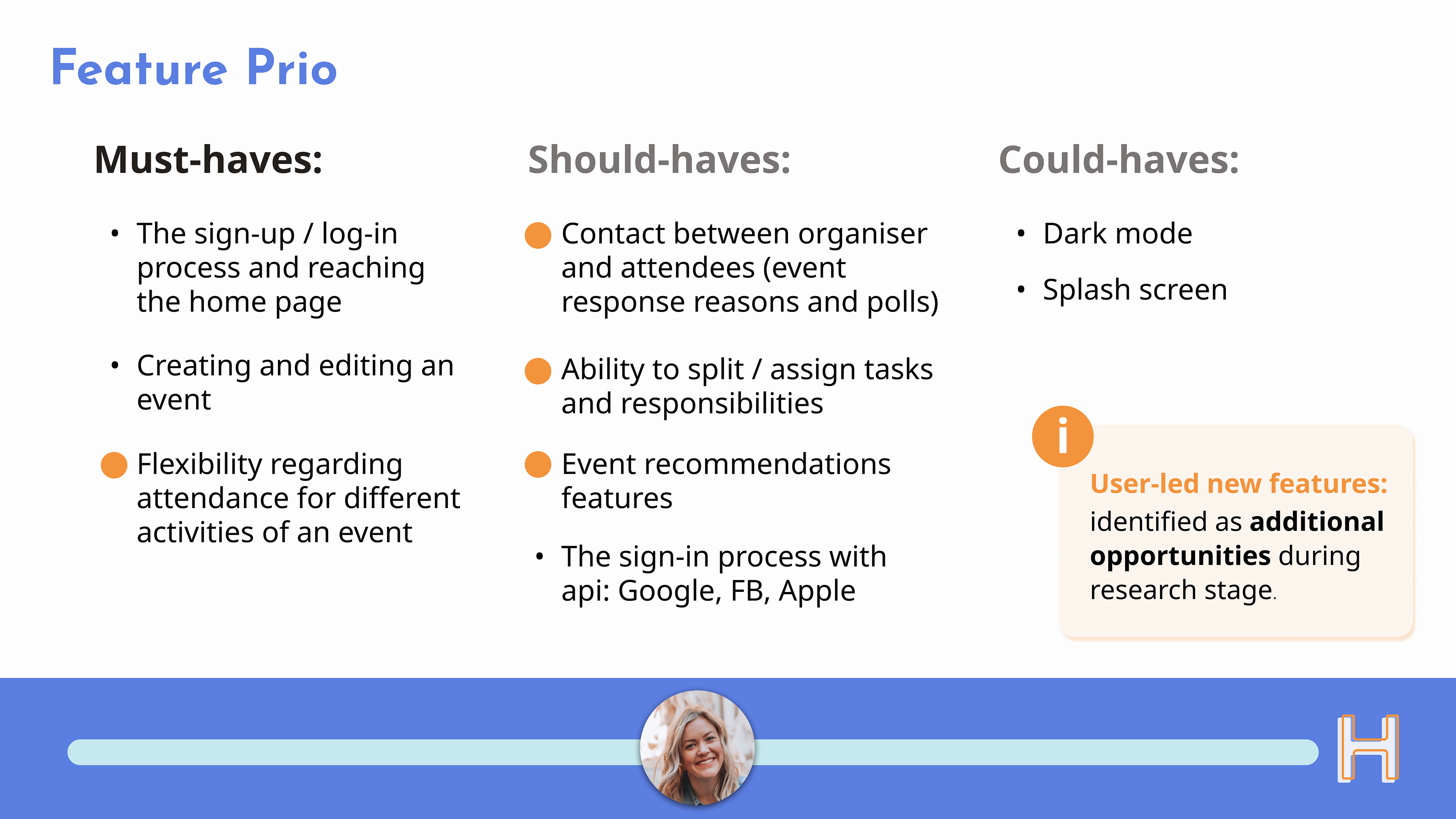
Based on our problem statement and Emma's main needs, we ideated and defined which "must-have" features to prioritse in the MVP prototype. These included some additional features as a result of the research insights.
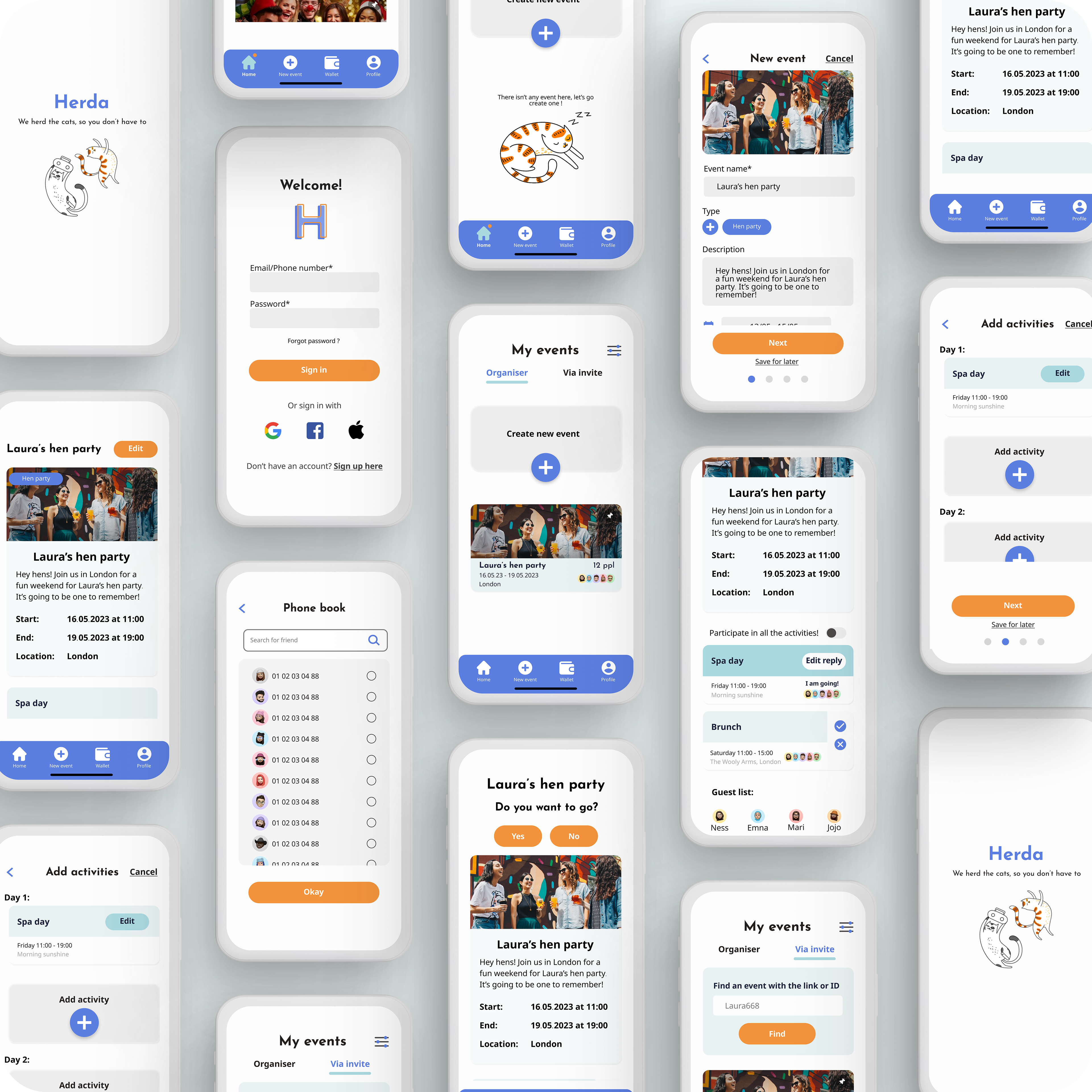
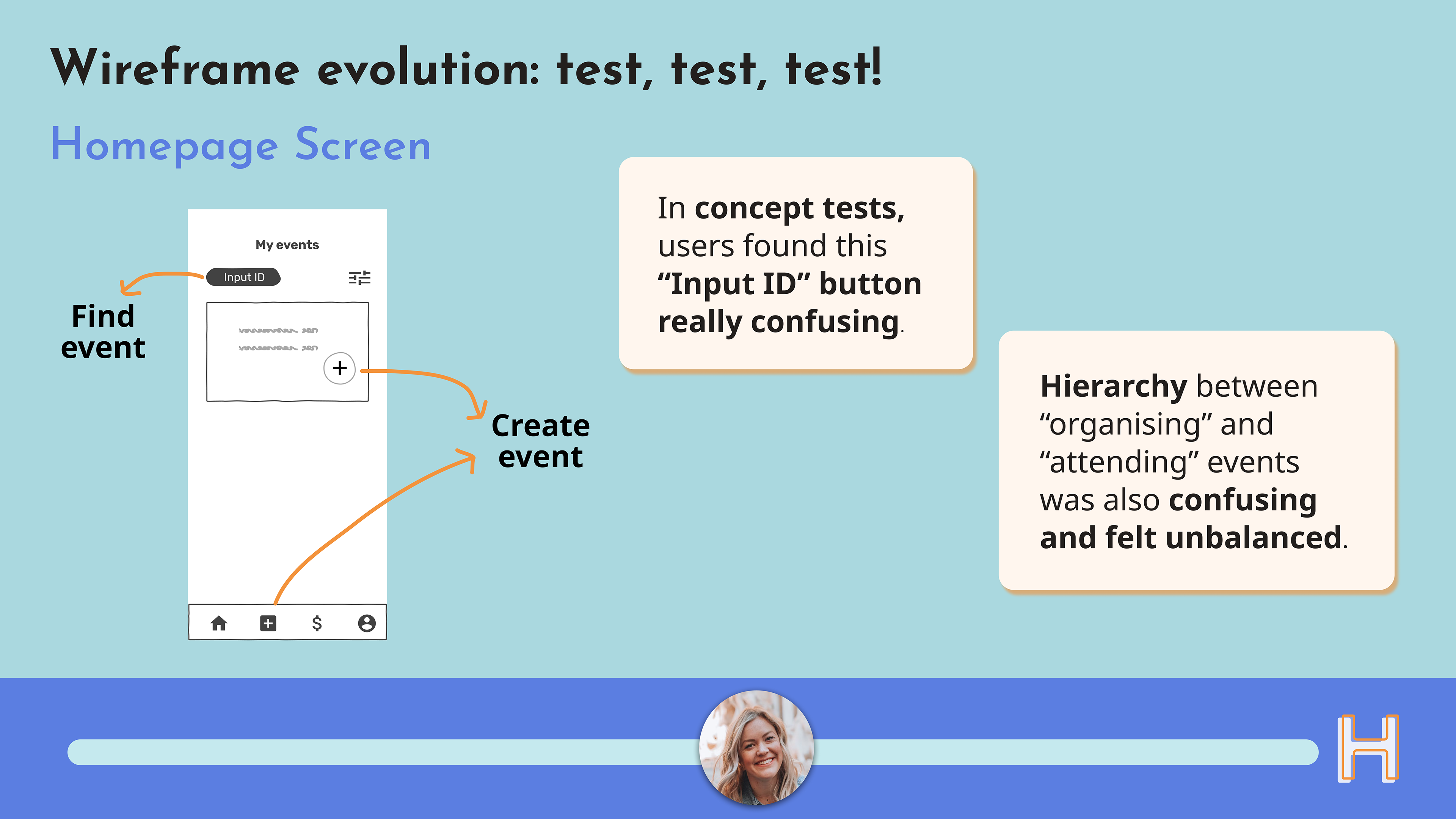
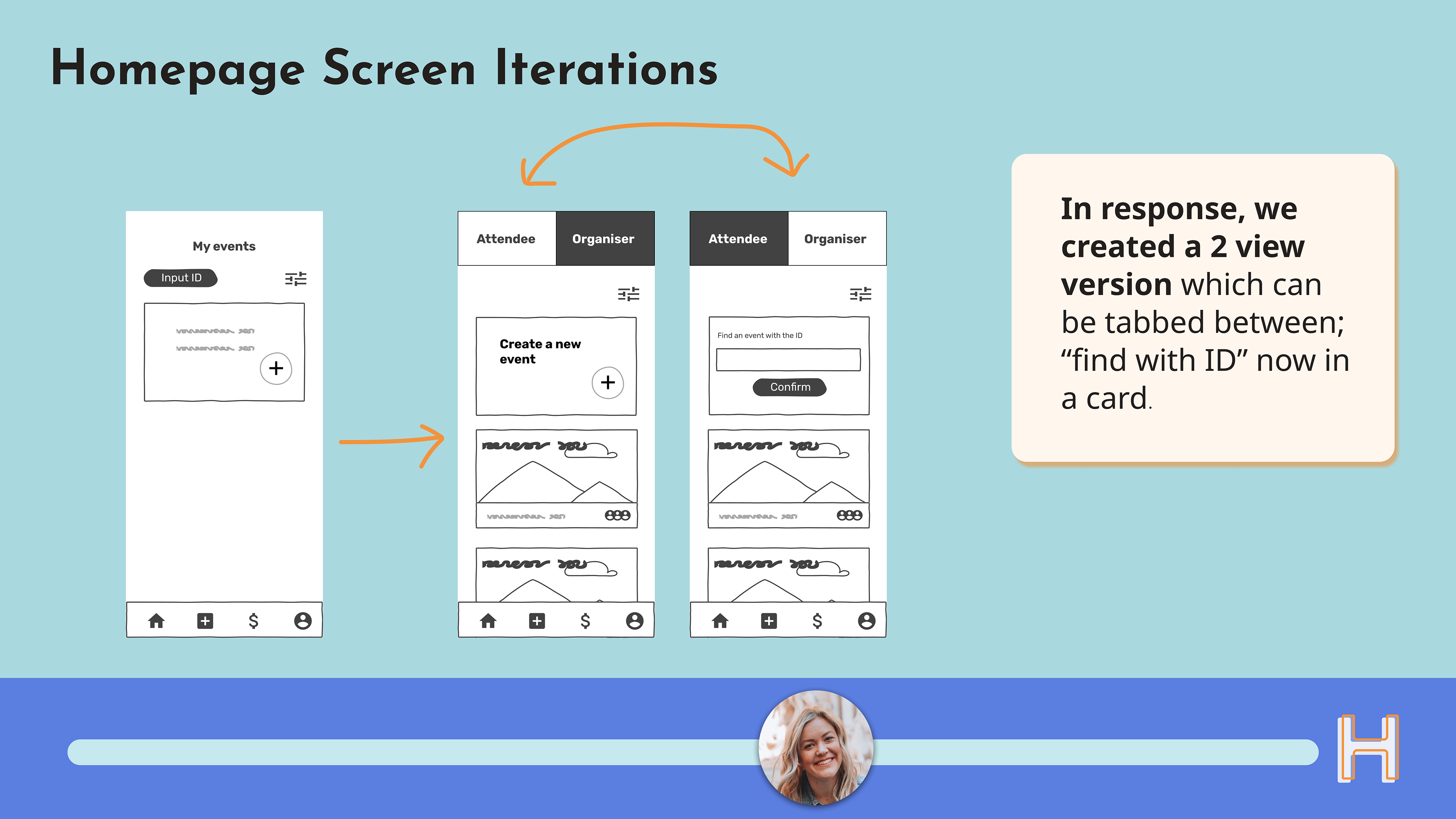
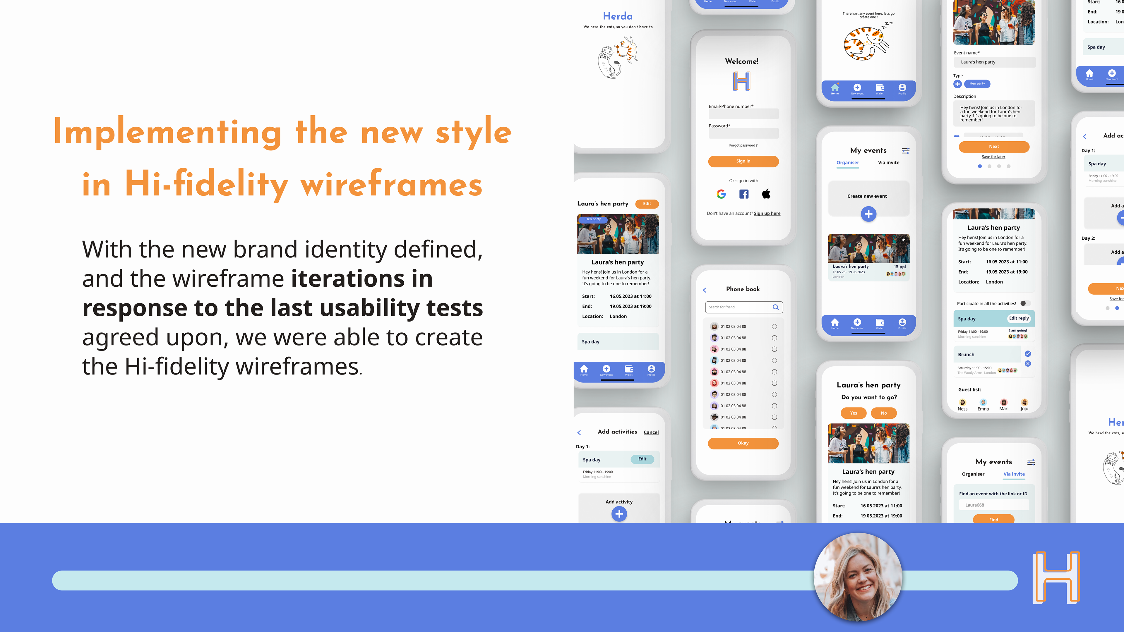
User Flows, Wireframes & User Testing
The user flows that we focused on for this project were:
1. Signing up and creating an event.
2. A user who already has an account but didn’t include their phone number on sign up, and receives an invite to an event via SMS, but doesn’t click on the link.
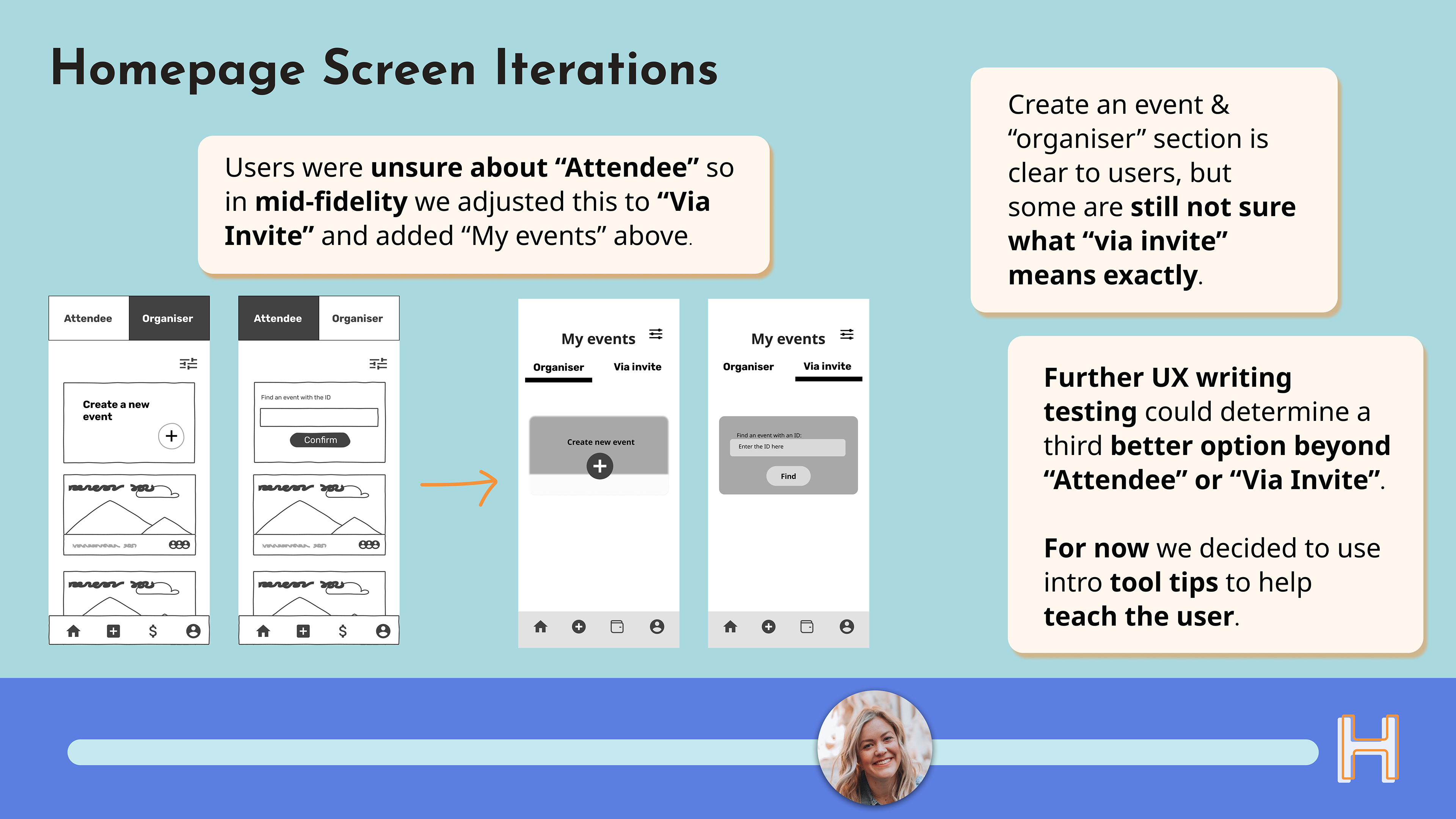
We created the feature of an Event ID to help users find an event they’ve been invited to in such a scenario.
We created the feature of an Event ID to help users find an event they’ve been invited to in such a scenario.

We defined new Brand Attributes for Cargo, combining the clean and intuitive feeling the Cargo team wanted the app to have, while keeping in mind the future wallet feature that would be implemented later on. The defined attributes were:
- Straightforward, Efficient, Communicative, Inclusive & Secure
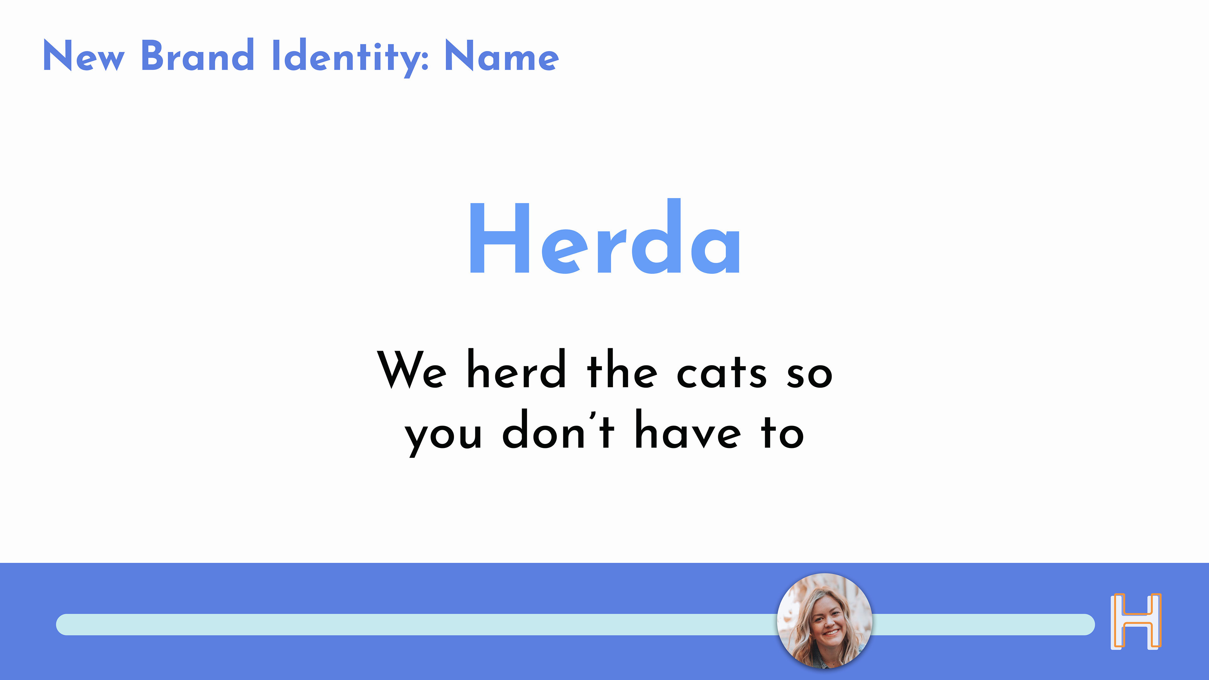
The Cargo team gave us a working tagline, which is based on an idiom "Like herding cats", which means something that is difficult to do. From this, we ideated the new brand name of Herda.
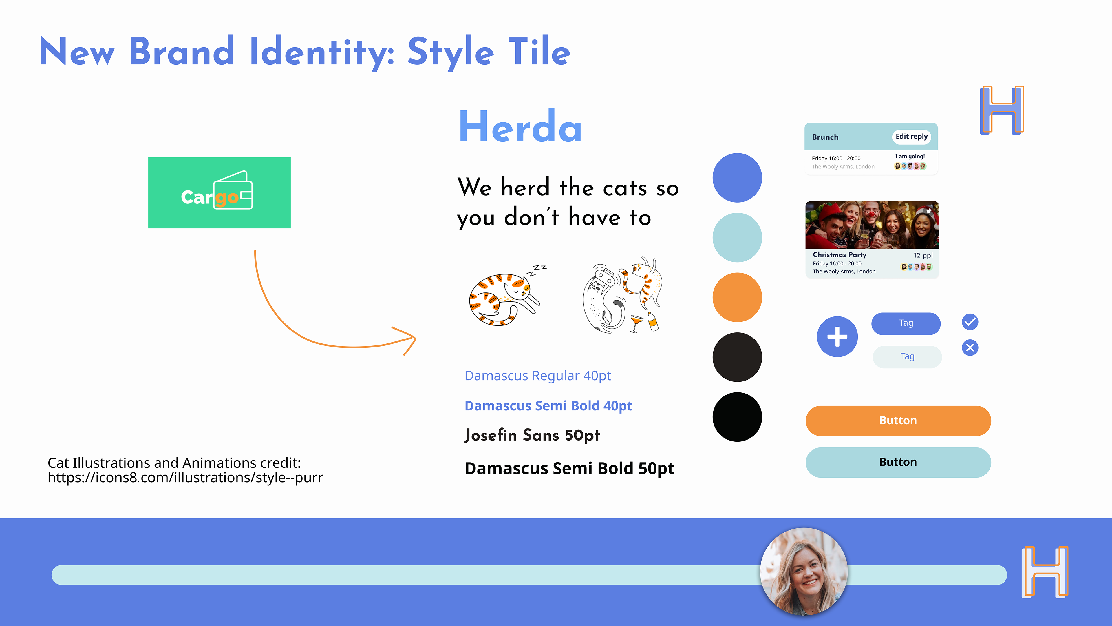
Then we were able to put together the new brand style, balancing the brand attributes in a palette which feels clean but with a touch of fun as the app will be used to plan fun events, and swapping out the current Cargo green to distinguish it from its closest competitors.
We incorporated a set of playful cat illustrations and animations from the Illustrator Ekaterina Rogova.
I created a simple "H" vector logo in Figma.
Here you can see the Hi-fi prototype in action. For video fluidity purposes, we have prototyped the 1st Flow to lead directly into the 2nd Flow.
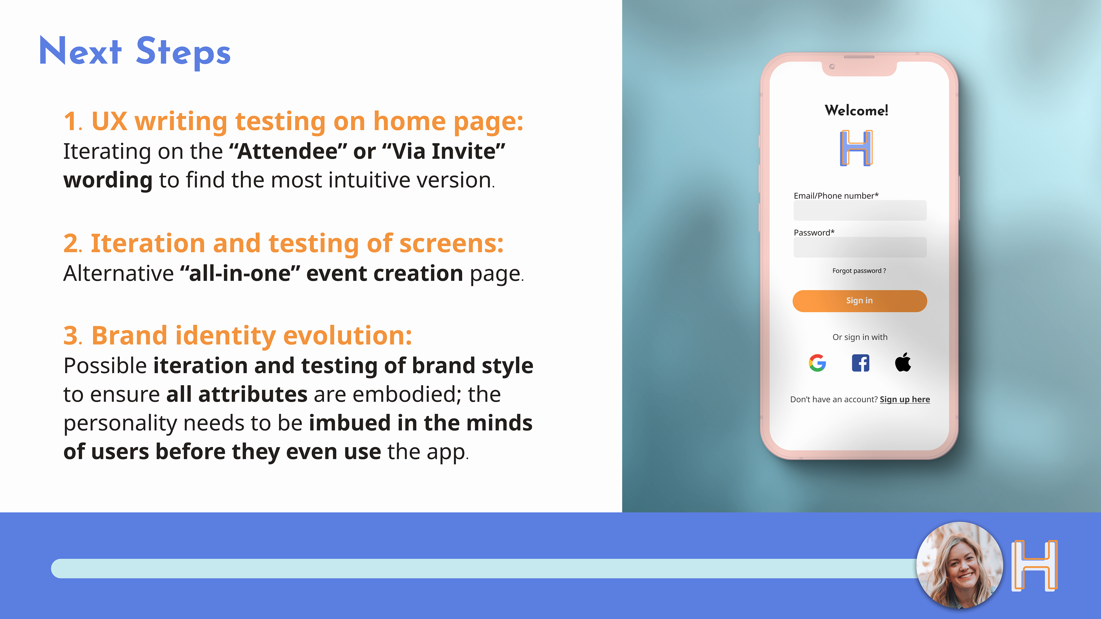
These are the core next steps we advised the Cargo team to take.
Key Learnings & Takeaways from this project
On a team level, we further experienced the importance of user testing as well as enjoying practicing transparent communication: both within the team and with the client. Making sure we were on the same page as the client from day 1 and providing regular updates meant we didn't encounter any wasted time due to miscommunication. It's also crucial for Agile UX Design.

